Master Medical Spa Website Design for 2026 Success
Your website probably looks better than it performs. That’s the situation a lot of medspa owners are in right now. They’ve got a polished homepage, a soft neutral color palette, a few treatment photos, and maybe even online booking. But inquiries are inconsistent, good-fit patients still call with basic questions, and too many visitors leave […]
LElemurApril 24, 202617 min read
In this piece
Your website probably looks better than it performs.
That’s the situation a lot of medspa owners are in right now. They’ve got a polished homepage, a soft neutral color palette, a few treatment photos, and maybe even online booking. But inquiries are inconsistent, good-fit patients still call with basic questions, and too many visitors leave without taking the next step.
That gap matters because medspa clients in major markets like the US average $1,200 per visit according to Ambrose Marketing’s medspa website design analysis. If someone is considering a high-ticket treatment, your website can’t feel like a placeholder. It has to feel credible, premium, easy, and trustworthy in seconds.
Good medical spa website design isn’t decoration. It’s positioning. It’s sales psychology. It’s local visibility. It’s the difference between “this place looks nice” and “I trust them enough to book.”
A medspa owner launches a new site. It’s tasteful. The homepage has beige tones, clean fonts, and a smiling model with flawless skin. Everyone on the team says it looks amazing.
Three months later, the same owner is frustrated. Organic traffic feels weak. Consult requests are uneven. The front desk keeps answering questions the website should have handled. The site looks premium, but it isn’t doing premium work.
A pretty site that underperforms is still a problem
That happens because many websites are built like digital brochures. They sit there. They describe services. They look acceptable on a desktop. But they don’t actively guide someone from curiosity to confidence.
A serious medical spa website design has to do more than impress peers in your industry. It has to reassure a first-time visitor who’s comparing you against other local options, weighing cost, results, safety, and the overall experience. If the site feels vague, generic, or hard to use, people hesitate.
Your website meets patients before your staff does. If it feels confusing, cold, or generic, that first impression sticks.
The strongest sites behave like a top-tier team member. They answer common questions clearly. They frame treatments in language patients understand. They make the next step obvious. They reinforce that your practice is both medically credible and emotionally comfortable.
What your website should be doing every day
Think of your site as the employee who never clocks out. It should be working on these jobs constantly:
Building trust immediately by showing your expertise, your process, and your real environment.
Qualifying leads so people understand who a treatment is for, what the experience is like, and when to book.
Reducing friction by making pricing conversations, FAQs, service details, and booking paths easier to access.
Reinforcing value so a premium consultation doesn’t feel overpriced. It feels well justified.
Supporting your team by cutting down repetitive phone calls and filtering out low-intent inquiries.
Here’s the blunt version. If your site looks luxurious but doesn’t move people toward action, it’s not a brand asset. It’s a decoration expense.
That doesn’t mean every medspa needs a flashy site or trendy animations. It means the site has to reflect how your practice earns trust in person. Calm, clear, polished, informative, and easy to act on. If your in-office experience feels high-quality but your site feels generic, patients notice the mismatch.
From Brand Story to Visual Identity
Most medspa websites jump straight to colors, fonts, and layout. That’s backward.
Strong design starts with identity. If you don’t know exactly who you are, who you serve, and why patients choose you, your site will look polished and still feel interchangeable.
Start with who you are, not what color you like
A lot of owners describe their brand with words like luxury, modern, refined, or clean. That’s not enough. Every other medspa says the same thing.
You need sharper answers. Are you the practice known for natural-looking injectables? Are you the warm, community-rooted medspa where first-time patients feel safe asking questions? Are you physician-led and clinically meticulous? Are you highly aesthetic but still approachable?
That strategic work matters because Weave’s medspa design coverage notes that existing content rarely addresses how to weave a practice’s unique story and community ties into the site, even though 68% of clients choose practices with relatable branding over polished but impersonal sites. In plain terms, generic luxury is losing.
Start with three decisions:
Define your patient fit Don’t market to “women 25 to 65.” That’s useless. Decide who your best-fit patient is. Busy professionals seeking maintenance. First-timers who want reassurance. High-end clientele who expect concierge-level ease.
Name your differentiator clearly Not “great service.” Something real. A conservative aesthetic philosophy. Advanced consultation process. A team known for education and bedside manner.
Choose a voice Is your practice calm and expert? Warm and conversational? Refined and editorial? Your copy needs a point of view.
Real team photography, conversational headlines, softer structure
Premium medical authority
Strong provider bios, structured service pages, elegant typography, confident messaging
Your logo, palette, type, and photography style should all support the same emotional message. If your brand is rooted in trust and education, don’t use visuals that feel performative or overly glamorous. If your brand is premium and design-forward, don’t pair that with flat copy and outdated page templates.
Practical rule: If a competitor could swap in their logo and the site would still make sense, your brand isn’t defined enough.
A few direct recommendations:
Use real photography whenever possible. Your space, providers, treatment rooms, and patient experience are part of the sale.
Pick typography that reads well first. Elegant doesn’t mean thin, tiny, or hard to scan.
Keep your color system disciplined. A few intentional colors beat a dozen “pretty” ones every time.
Good medical spa website design feels distinctive without trying too hard. Patients should land on your site and sense an actual practice with an actual personality, not a template wearing expensive makeup.
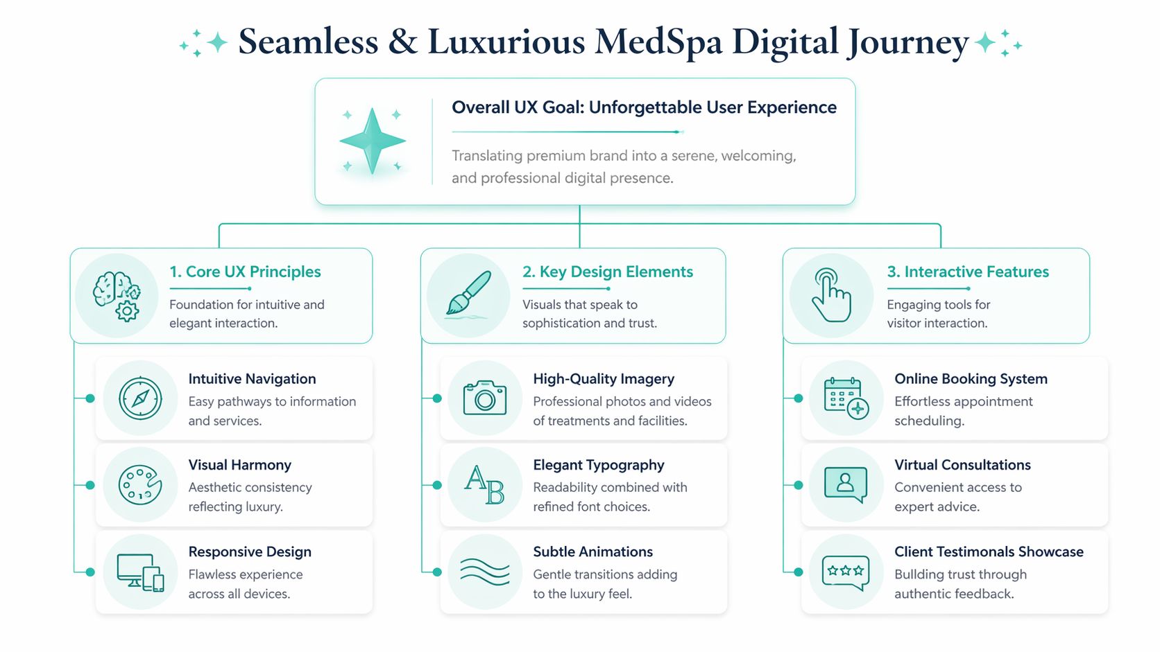
Creating a Seamless and Luxurious Digital Journey
Luxury online doesn’t come from adding gold accents, slow fade-ins, or giant hero videos. It comes from removing effort.
If a patient can move through your site smoothly, understand what you offer, trust what they’re seeing, and book without friction, the experience feels premium. If they have to hunt, wait, pinch, scroll, or guess, the illusion breaks.
Luxury online feels effortless
This matters even more on phones. Aesthetic Conversion reports that over 72% of medspa-related searches occur on mobile devices as of 2025, and that Google’s Core Web Vitals directly impact SEO and conversion. That means your site isn’t mainly being judged on a large desktop monitor. It’s being judged in someone’s hand, while they’re comparing options quickly.
That same source ties strong medspa design to clean layouts, elegant fonts, and high-quality galleries that match the luxury experience patients expect. I agree with that, but here’s the important extension. “Luxury” online is a usability standard, not a mood board.
A useful benchmark is this. If a new visitor can’t do these things without thinking, the experience needs work:
Most underperforming medspa sites have page-level design, not journey-level design. Each page looks fine alone, but the path between pages feels random.
The better approach is to design around decision flow. A visitor lands on a service, evaluates trust, checks results, reads FAQs, reviews provider credibility, and then decides whether to book. Your layout should support that sequence.
Here’s what that usually looks like in practice:
Navigation that stays simple Keep the top menu focused. Services, About, Results, Reviews, Contact, Book. That’s enough for most medspas.
Service pages that open with clarity Lead with who the treatment is for, what concern it addresses, and what kind of outcome people seek.
Images that prove, not decorate Show your team, your space, your real work, and your actual atmosphere. Don’t hide behind generic stock photography.
A luxurious website feels calm because the visitor never has to work hard.
The physical spa experience is a good analogy. In a well-run practice, people know where to check in, what comes next, and how they’re being cared for. Your website should deliver that same sense of orientation.
If your digital experience feels crowded, inconsistent, or hard to use, patients won’t describe it in technical terms. They’ll just leave.
Turning Website Visitors into Booked Appointments
A medspa website doesn’t fail because it lacks information. It fails because it gives information without persuasion.
People rarely book because they saw a treatment name and a nice photo. They book when the site answers the emotional questions underneath the treatment search. Will I look natural? Will I be judged? Is this provider experienced? Am I in good hands? Is this worth the price?
Stop listing treatments and start selling outcomes
Your copy should sell the result, the feeling, and the experience. Not just the procedure.
That approach aligns with Lifted Logic’s medspa website guidance, which says high-converting medspa sites use advanced conversion psychology to sell “outcomes, experience, and expert hands”. The same source says elements like AI-driven procedure quizzes can boost engagement by 40%, and that sites lacking “virtual conversation” flows see a 25% conversion drop.
That phrase matters. A virtual conversation is what happens when the page anticipates hesitation and answers it before the patient has to ask.
Compare these two approaches:
Weak copy
Stronger copy
“We offer dermal fillers for facial rejuvenation.”
“Restore volume in a way that looks refreshed, not overdone.”
“Botox treatments available.”
“Smooth expression lines with a plan that fits your features and goals.”
“Book today.”
“Schedule a consultation and get a personalized recommendation.”
The second column works better because it speaks to motivation and fear at the same time.
Build a virtual conversation that reduces hesitation
Conversion-focused design isn’t about shouting “Book Now” everywhere. It’s about giving people enough confidence to say yes.
Here are the elements I’d insist on for almost every medspa site:
Outcome-led headlines Speak to the desired change first. Better skin clarity, softer lines, more confidence, less downtime anxiety.
Detailed provider context A provider bio shouldn’t read like a résumé dump. Explain philosophy, specialties, and what patients can expect during care.
Objection-handling FAQs Cover candid questions. Does it hurt? How long does it last? Is there downtime? Who isn’t a good candidate?
Strategic calls to action Put a primary action in the hero, mid-page, and after trust-building content. Keep the wording consistent.
Booking software that doesn’t create friction If your current system is clunky, slow, or confusing on mobile, replace it. Tools like spa appointment scheduling software from Twizzlo are worth reviewing because the booking layer is where many good websites lose ready-to-act patients.
If a visitor has to call for basic next steps, your website is making the sale harder than it needs to be.
You don’t need gimmicks. You need structure. Clear service pages, persuasive copy, trust signals, and a booking path that feels simple. When those pieces work together, your site stops being informational and starts producing appointments.
Getting Found by Patients in Your Community
Local visibility is where many medspa websites fall apart. Owners invest in design, but they never build the search structure that helps nearby patients find the site in the first place.
If you want to rank for treatment intent, your website needs depth, not a single “Services” page with a long list of links.
Create a page for every real service you want to rank for
One of the clearest best practices comes from Lead to Conversion’s medspa UX guidance, which says SEO-optimized service pages for each treatment establish topical authority and can reduce bounce rates by 25% to 40%. The same source says schema markup can boost click-through rates from search results by 30%.
That means each core treatment should have its own dedicated page. Botox. Fillers. Microneedling. Laser hair removal. Skin tightening. Hydrafacial. Whatever you actually want to win on locally.
Each page should include:
A clear treatment overview that explains what it is in plain language
Candidate guidance so readers know if the service fits their concern
Expected experience details including what a consult or appointment is like
FAQ content that answers common hesitations
Internal links to related treatments and the booking page
Don’t publish thin pages just to check an SEO box. Thin pages won’t rank well and won’t convert well.
Own your local search presence
Your Google Business Profile matters. Your reviews matter. Your location pages matter if you serve multiple communities. And your site should reflect the exact treatments and areas you want to be known for.
If you want a useful primer on how search is evolving beyond classic keyword rankings, this breakdown of AEO vs SEO vs GEO is worth reading. It helps clarify why medspas need content that works for traditional search, answer-driven experiences, and AI-generated discovery.
For local medspas, I’d focus on this stack:
A fully built out Google Business Profile with accurate categories, services, hours, and photos
Dedicated treatment pages written for patient intent, not industry jargon
Review generation and review display so trust signals support both rankings and conversion
Local optimization on core pages using natural references to the communities you serve
Most medspas don’t need broader traffic first. They need the right local traffic with clear treatment intent.
That’s the priority. Be visible where nearby patients search, then make sure the landing page earns the click.
Essential Technical and Compliance Requirements
A medspa website can look polished and still be broken underneath. That hidden layer affects rankings, conversions, accessibility, privacy, and legal risk.
This is the part owners often push off because it isn’t glamorous. That’s a mistake. Technical quality is part of the brand experience.
Technical performance is part of the brand experience
Selworthy’s med spa web design analysis states that approximately 70% of website visitors access medspa sites via mobile devices, and that improving mobile page load speed by one second can boost conversions by 13% and cut bounce rates by 14 points.
That’s not a minor improvement. It’s a direct business issue.
When a medspa site loads slowly, visitors don’t think, “This website has inefficient assets.” They think, “This place feels outdated,” or “I’ll check another option.” Speed, responsiveness, and touch-friendly layouts shape perceived quality.
A strong technical baseline includes:
Responsive layouts that work cleanly across phones, tablets, and desktops
Compressed images so galleries don’t drag down load time
Fast-loading templates and scripts instead of plugin bloat
Readable text and tap-friendly buttons for mobile usability
Routine testing in tools like Google PageSpeed Insights and real-device checks
Privacy, accessibility, and forms need adult supervision
For medspas, compliance isn’t optional.
If your website collects patient information through consultation forms, online booking, chat tools, or lead magnets, you need to think carefully about privacy and workflow. Don’t add random widgets because they look convenient. Vet what data they collect, where it goes, and who can access it.
Accessibility matters too. ADA-minded website practices improve usability for everyone, not just a subset of users. Clear heading structure, keyboard accessibility, sufficient contrast, descriptive alt text, and form labels are not nice extras. They’re part of a professional build.
A simple checklist helps:
Area
What to check
Forms
Ask only for necessary information and route submissions securely
Booking tools
Review privacy implications and mobile usability before integrating
Accessibility
Check contrast, alt text, headings, focus states, and form labels
Content updates
Remove outdated promotions, expired claims, and old provider details
Plugins and integrations
Keep only what serves a clear purpose
Bottom line: A medspa website should protect trust behind the scenes as carefully as it builds trust on the screen.
When the technical foundation is clean, your marketing performs better, your site feels more polished, and your team has fewer problems to clean up later.
Your Website as a Flourishing Practice Partner
The best medical spa website design doesn’t come from chasing trends. It comes from alignment.
Your story, your positioning, your user experience, your conversion flow, your local visibility, and your technical foundation all need to support the same business outcome. More trust from the right patients. More qualified consultations. A stronger reputation in your community.
A strong medspa website does five jobs at once
When a site is working well, it doesn’t just “look nice.” It acts like a growth partner.
It tells a clear brand story. It makes the digital experience feel calm and premium. It persuades without pressure. It helps local patients find you. It supports the kind of trust that high-value services require.
That’s why website decisions shouldn’t be made in isolation. Copy affects conversion. Design affects trust. structure affects SEO. Technical performance affects every stage of the visit.
Treat the website like a growth asset
If your current site feels off, don’t start by asking which template looks better. Ask harder questions.
Does this site sound like our practice?
Does it help first-time patients feel safe?
Does it guide people toward booking?
Does it support how we want to be known locally?
Does it reflect the quality of care we provide?
If the answer is no, the issue usually isn’t cosmetic. It’s strategic.
A high-performing medspa website should feel like your best front desk coordinator, your best educator, and your best brand representative working together. Not louder. Smarter. More intentional. More aligned with the value you deliver in person.
That’s how practices stop treating the website like an online brochure and start using it like an engine for steady growth.
If your medspa website looks polished but isn’t bringing in the right patients, it may be time for a stronger strategy behind the design. Leaping Lemur Media helps practices build marketing that sounds like them, feels like them, and connects them with the people who need them most.