You approved your logo on screen. The teal looked clean, expensive, and exactly right. Then the business cards arrived, and the color felt flatter. The brochure looked a little different again. The retractable banner was close, but not close enough. That's the moment most owners run into PMS and CMYK for the first time, usually […]
LElemurJuly 2, 202615 min read
In this piece
You approved your logo on screen. The teal looked clean, expensive, and exactly right. Then the business cards arrived, and the color felt flatter. The brochure looked a little different again. The retractable banner was close, but not close enough.
That's the moment most owners run into PMS and CMYK for the first time, usually after money has already been spent.
For a dentist, medspa owner, eye doctor, law firm, or any local business trying to look consistent across print, this isn't a design trivia question. It affects how polished your brand feels, how often you reprint, and whether your materials match from one vendor to the next. It also affects how your team communicates with designers and printers. If they're all using different assumptions about color, you end up paying for avoidable fixes.
A big part of the confusion starts with the jump from screen color to print color. Your monitor shows color differently than ink on paper, so understanding profiles matters before you ever approve a proof. If you want a useful primer on that side of the process, this guide to color profiles is worth reviewing.
A practice owner launches with a polished new brand. The website looks sharp. Social posts look sharp. The logo file arrives with HEX values, RGB values, and maybe a style guide that seems complete enough.
Then print enters the picture.
The appointment cards come back slightly muted. The folder for new patient packets looks warmer than expected. A front-desk sign printed by another vendor leans cooler. None of these pieces are disastrous on their own, but together they make the brand feel less controlled than it should.
That's usually not because the printer made a simple mistake. It's because two different print approaches solve two different problems. CMYK is built for process printing and broad flexibility. PMS is built for exact color consistency. If you don't choose intentionally, a logo color that felt refined on screen can drift once ink hits paper, vinyl, packaging, or fabric.
Why owners get caught off guard
Most business owners approve color visually on a monitor, where RGB is doing the work. Printing doesn't use light that way. It uses ink, paper, coating, and press conditions. So a “brand blue” isn't one thing in every context unless someone defines it correctly for every production method.
That disconnect is expensive because reprints often happen after the team has already approved the wrong file setup.
A color problem rarely starts at the press. It usually starts when nobody decided whether the job needed precision or flexibility.
Where this becomes a business issue
For a medical practice or small business, consistent color isn't vanity. It signals order, trust, and professionalism. Patients and clients may not say, “Your Pantone match is off,” but they do notice when your materials don't feel cohesive.
That's why the PMS and CMYK decision belongs near the start of a project, not the end.
Understanding CMYK The Standard for Full-Color Printing
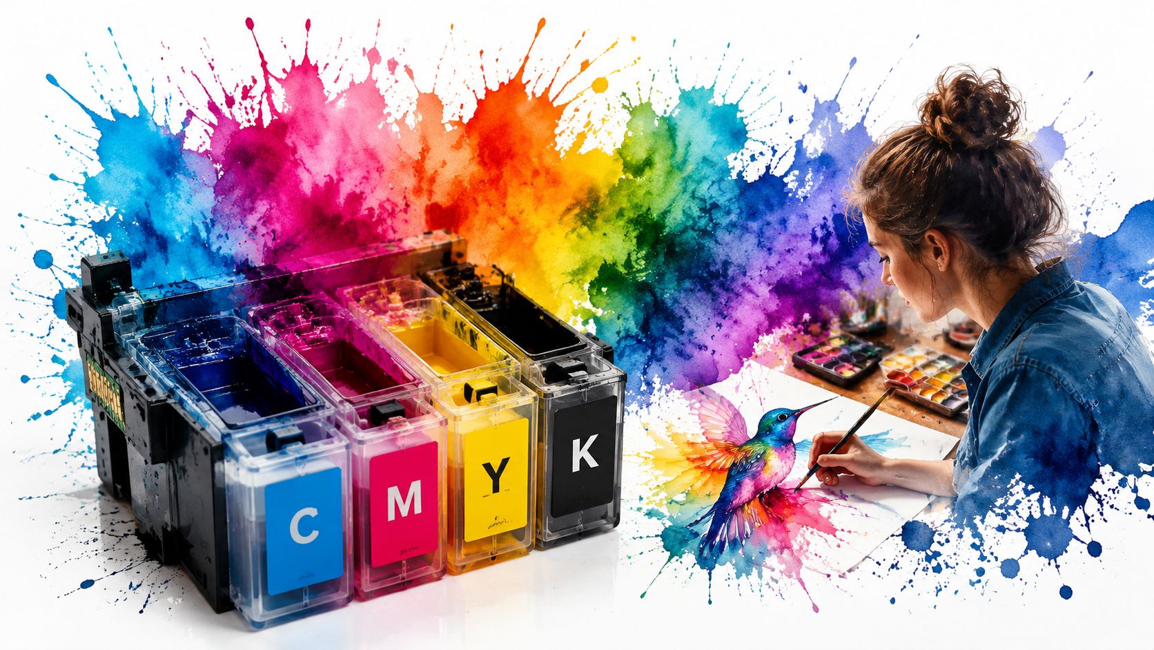
CMYK stands for Cyan, Magenta, Yellow, and Key (Black). It's called the four-color process because printers combine those four inks to create a wide range of colors on paper. CMYK printing was first implemented in 1906 by the Eagle Printing Ink Company. This process uses a subtractive color system, meaning it works by absorbing light from paper, and it remains the baseline for virtually all business cards, brochures, and posters produced today.
How CMYK actually builds color
Think of CMYK like mixing a limited set of paints to create the impression of a full image. The press doesn't usually lay down one perfect custom ink for every color in your design. Instead, it places tiny transparent dots of cyan, magenta, yellow, and black in different combinations and densities. Your eye blends those dots into photographs, gradients, skin tones, and illustrations.
That's why CMYK is the standard choice for designs with lots of color variation. If your brochure has staff photos, interior shots, product images, and layered graphics, CMYK is usually the practical solution.
Where CMYK works best
CMYK shines when the piece is visually complex and you need a lot of range from one print process.
Photo-heavy brochures: Staff portraits, before-and-after style visuals, and office photography fit naturally in CMYK.
Menus, flyers, and postcards: If the design uses multiple images, gradients, and colored backgrounds, CMYK keeps production straightforward.
General marketing materials: Most commercial print shops are optimized around CMYK workflows.
What CMYK doesn't do well
CMYK is flexible, but it isn't perfect for color-critical branding. Because it creates color through overlapping dots, results can shift depending on paper, coating, and printing method. A logo color can look acceptable on one run and slightly different on another.
That doesn't mean CMYK is bad. It means you should use it for the jobs it was built to handle.
Practical rule: Use CMYK when the project needs many colors, photographic detail, or efficient full-color production.
For many small businesses, CMYK will handle the majority of day-to-day print work well. Problems usually start when owners expect CMYK to behave like a custom-mixed brand ink.
What Is Pantone PMS and Why It Ensures Consistency
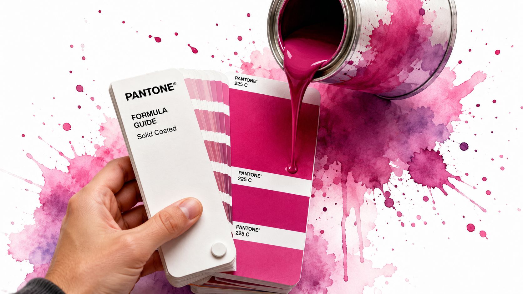
Pantone Matching System (PMS) is a standardized color system built around pre-mixed spot colors. Pantone was released in 1963 to streamline color matching. Unlike CMYK, which mixes colors during printing, PMS uses pre-mixed spot colors based on a proprietary formula, resulting in the most consistent and vibrant reproduction for brand identities.
Why Pantone feels different in practice
A good way to think about PMS is factory-formulated paint. If you buy a specific paint formula, you expect that exact shade every time. Pantone works the same way. Instead of asking a press to simulate your brand color using four process inks, you specify a defined spot color that's mixed before production.
That's why Pantone is so valuable for logos and identity systems. If your practice has a signature navy, a specific sage green, or a refined blush tone that sits at the center of the brand, PMS helps protect it across different vendors and materials.
Where PMS earns its keep
Pantone matters most when color itself is part of the asset's value.
Logo-driven stationery: Letterhead, envelopes, presentation folders, and business cards often benefit from spot color consistency.
Packaging and labels: If the same branded color needs to show up repeatedly across product lines, PMS gives you tighter control.
Branded merchandise and specialty pieces: Pens, folders, signage elements, and textiles often rely on Pantone references because the brand color has to survive across substrates.
When a brand depends on one exact shade being recognizable, PMS is usually the safer choice.
Why owners sometimes skip it
The trade-off is production complexity. Spot colors are excellent for precision, but they're not always the most efficient route for image-heavy materials. If you're printing a booklet with photography, gradients, and multiple colored elements, Pantone alone won't be the smoothest workflow.
That's why smart print strategy often separates brand-critical assets from artwork-heavy assets. PMS protects the parts that must match. Other methods handle the parts that need broader visual range.
For non-technical owners, that distinction removes a lot of frustration. You don't need one perfect color system for everything. You need the right system for each job.
Comparing PMS and CMYK Across Key Factors
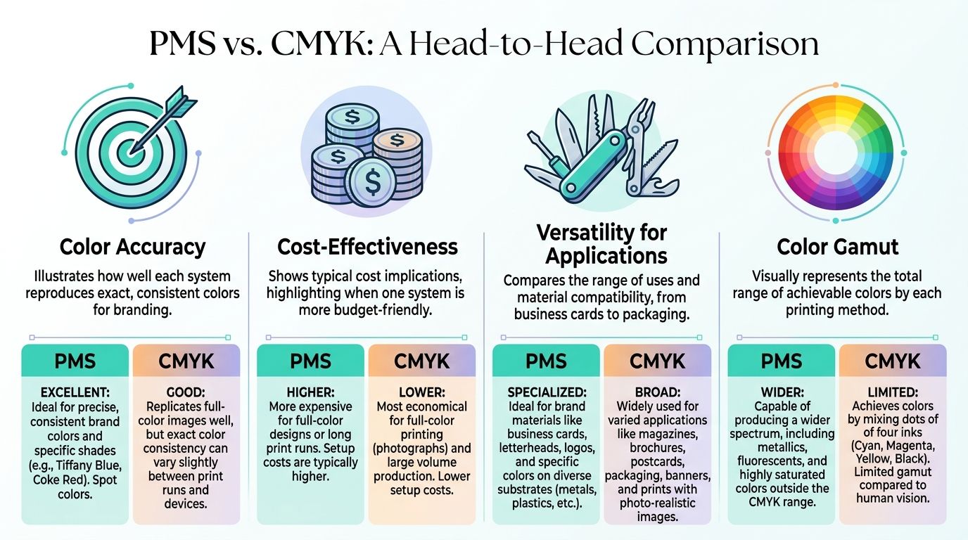
When owners compare PMS and CMYK, the right choice usually comes down to four questions. Do you need exact color matching? Are photos involved? Is budget tight? Will this piece need to be reproduced across multiple vendors and materials?
Photos, brochures, postcards, general full-color materials
How color is made
Pre-mixed spot ink
Four-color process using cyan, magenta, yellow, and black
Consistency
Strong across runs and substrates
More variable depending on press and material
Vibrancy
Broader access to vivid spot colors
Limited by process gamut
Cost fit
Better when exact color matters more than flexibility
Better for full-color artwork and complex layouts
Typical decision
Choose when one exact color must hold
Choose when many colors must work together efficiently
PMS is for precision. CMYK is for process.
Accuracy And Consistency
According to Fujifilm's overview of Pantone versus CMYK printing, PMS utilizes pre-mixed spot colors for superior consistency, while CMYK creates its spectrum by overlapping microscopic dots, which introduces inherent variability. That's the core operational difference.
If your logo appears on stationery, signage, packaging, and branded pieces from different suppliers, PMS gives you a stronger reference point. If your project is a single brochure run with photos and gradients, CMYK usually gives you enough control without overcomplicating the job.
Color Gamut And Vibrancy
Pantone also offers a significantly wider range of vibrant hues that fall outside the CMYK color space according to that same Fujifilm explanation of spot color and process color. In plain terms, some colors don't translate cleanly into CMYK.
That's why highly saturated brand colors can lose their character when converted. Rich oranges, electric greens, neons, and specialty shades are where disappointment tends to show up first.
Cost And Production Trade-Offs
CMYK is usually the practical choice for dense, full-color layouts because one process handles many visual elements at once. PMS becomes more attractive when the design is simpler but the color standard is stricter.
For a small business owner, the financial question isn't “Which one is cheaper?” It's “Which one avoids waste on this specific job?” Saving on the front end doesn't help if the final piece looks off and needs to be redone.
Flexibility And Best Uses
CMYK wins on flexibility. It's built for photos, gradients, and multi-color compositions. PMS wins when visual identity has to stay stable.
A useful way to decide is to separate brand assets from marketing assets.
Hybrid jobs: a brochure with photography plus a critical logo color may justify both systems in one project
That last category gets overlooked. A lot of owners assume they have to choose one system for everything, when a hybrid approach often solves the underlying problem.
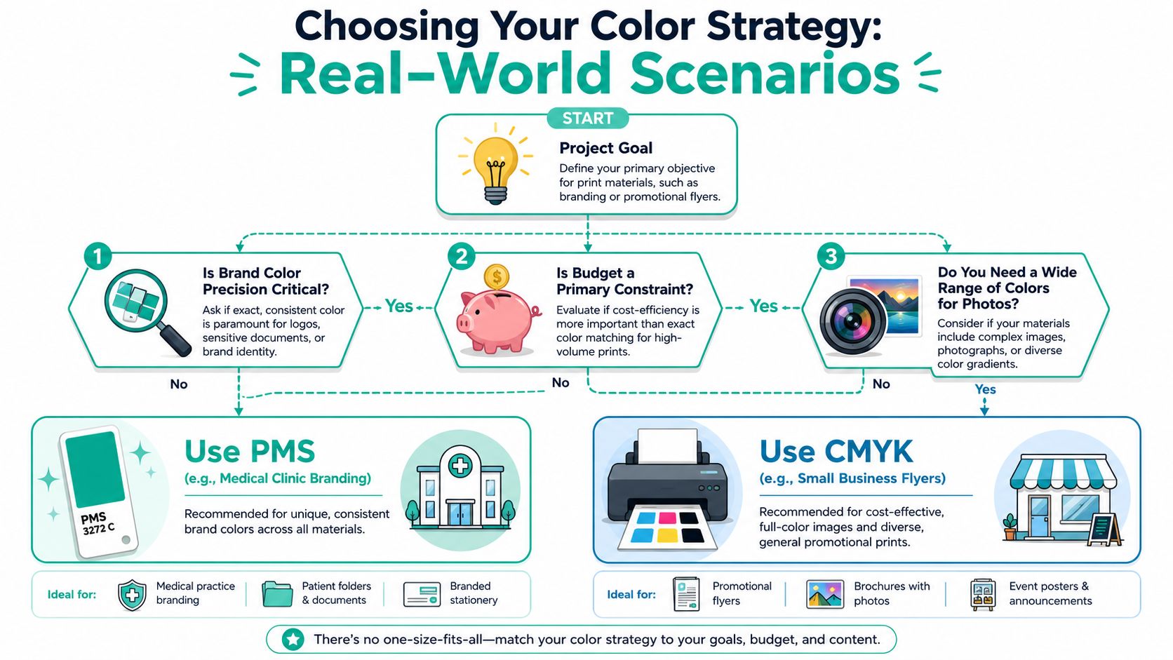
Choosing Your Color Strategy Real-World Scenarios
The choice between PMS and CMYK gets easier when you stop thinking in abstract print terms and start thinking asset by asset.
For Logos And Everyday Brand Materials
If you've invested in a polished identity and your logo color is central to how patients or customers recognize you, PMS is often the better decision for business cards, letterhead, presentation folders, and similar pieces.
This matters more than many owners expect. A source discussing the Pantone to CMYK fidelity gap notes that 12–18% of Pantone colors, especially neons and metallics, fall outside the CMYK gamut. That's why a logo can look notably duller after conversion.
If your brand depends on a distinctive color, don't let the printer “get close” unless you've already seen and approved that compromise.
For Brochures Menus And Photo-Heavy Pieces
A medspa brochure with treatment photos, a dental mailer with office images, or a restaurant-style menu layout usually belongs in CMYK. Those jobs need broad color range across many elements, not one exact spot color.
That doesn't mean the logo is irrelevant. It means the whole piece is being optimized for complex artwork. In those cases, ask your printer whether a hybrid setup makes sense if your logo color is especially sensitive.
For Signage Packaging And Event Graphics
Strategy matters most. A trade show banner, wall graphic, or product package often has both priorities at once. It needs visual impact, and it also needs brand control. If you're evaluating booth graphics or larger branded displays, reviewing examples of Exhibition Stand Design can help you see how color consistency plays out in real event environments.
For campaigns where you need advice across print and brand systems, it helps to talk through the use case before production starts. That's the kind of discussion you can start through this project inquiry page.
The expensive mistake isn't choosing PMS or CMYK. It's choosing by habit instead of by asset.
A practical framework looks like this:
Use PMS when the color itself carries brand equity.
Use CMYK when the piece is driven by photos, gradients, or many design elements.
Use a hybrid approach when both brand precision and image richness matter in the same job.
That last option is often the most useful for growing practices. It protects the logo without forcing the whole job into a less efficient setup.
How to Prepare Your Files for Flawless Printing
Most print problems don't come from bad taste. They come from bad handoff.
A file that looks polished on screen can still fail in production if the wrong color mode, wrong profile, or wrong assumptions are baked in. That's why owners need a simple process for reviewing files before anything goes to press. If you need support with broader brand and creative execution before files ever reach the printer, a clear overview of marketing and creative services helps frame what should be defined upstream.
Start With The Right Color Intent
If the job is brand-critical, define the Pantone color first. If the job is process-driven, define the CMYK target for the actual print condition. Don't rely on a designer's screen alone.
A common mistake is converting RGB or HEX to CMYK first and then trying to back into Pantone. According to Adobe community guidance on better PMS and CMYK conversion workflows, that approach can lose 30%+ of vibrancy upfront. The same discussion notes that measuring a physical PMS swatch in L*a*b* color space and converting to the correct CMYK press profile can deliver 40% higher fidelity than software auto-conversion.
That's a technical detail, but the business takeaway is simple. Automatic conversion isn't reliable enough for important brand colors.
What To Ask Your Designer And Printer
You don't need to speak like a press operator. You just need to ask the right questions.
Ask for the defined brand color system: Is this logo specified as Pantone, CMYK, RGB, and HEX, or are people guessing from one version?
Ask what stock is being used: Coated and uncoated papers can change how the same color appears.
Ask whether the proof is digital or physical: For color-sensitive work, a hard proof is safer than approving from a monitor.
What To Check Before You Approve
Review proofs with a short checklist instead of a gut reaction.
Check the logo first. If that's off, the whole brand will feel off.
Compare across materials. A card, folder, and sign don't need to be identical in every context, but they should feel intentionally related.
Watch dark neutrals and blues. These often drift in ways owners notice immediately.
Confirm the production method. The same file may behave differently in offset, digital, large format, or specialty printing.
If the job would be expensive to rerun, the proof deserves more scrutiny than the design presentation did.
The better your file prep and proofing process, the less likely you are to pay twice for the same marketing piece.
Your PMS and CMYK Questions Answered
Owners usually understand the basics once they see a few examples. The next questions are more practical.
Can I use both PMS and CMYK on the same print job
Yes, sometimes that's the best answer. A hybrid job makes sense when your piece includes photography or full-color artwork but still has one brand color that can't drift. That setup is common when the logo matters as much as the imagery.
Why does my bright Pantone blue turn purple or dull in CMYK
Because some Pantone colors sit outside what CMYK can reproduce cleanly. When software tries to simulate a spot color with process inks, it often sacrifices saturation or shifts the hue. That's why your screen mockup and your printed result can feel like different brands.
What does coated versus uncoated mean for Pantone
It refers to the paper surface. Coated stock tends to hold color differently than uncoated stock, so the same Pantone reference can appear different depending on the material. If you print on both, review both. Don't assume one approval covers every substrate.
For businesses also producing apparel or merch, the print setup adds another layer. This practical overview of preparing artwork for screen printing is useful because it shows how production method changes the way color decisions should be handled.
If you want more practical marketing guidance beyond print production, the articles on the Leaping Lemur Media blog are a good next step.
If your practice is trying to build a brand that feels consistent online, in print, and in physical spaces, Leaping Lemur Media helps turn that into a system instead of a guessing game. The goal isn't just attractive marketing. It's marketing that sounds like you, feels like you, and shows up clearly wherever patients or customers encounter your brand.