Master Food Truck Branding: Attract Crowds in 2026
The U.S. food truck market was valued at USD 2.01 billion in 2025 and is projected to reach USD 3.56 billion by 2033, with a 7.5% CAGR, according to Grand View Research's U.S. food truck market report. That changes the branding conversation immediately. You are not decorating a side hustle. You are building a brand […]
LElemurJune 4, 202617 min read
In this piece
The U.S. food truck market was valued at USD 2.01 billion in 2025 and is projected to reach USD 3.56 billion by 2033, with a 7.5% CAGR, according to Grand View Research's U.S. food truck market report. That changes the branding conversation immediately. You are not decorating a side hustle. You are building a brand inside a scaled, crowded hospitality category where customers make snap decisions at curbs, festivals, office parks, and parking lots.
Great food still matters most once someone orders. Branding is what gets them to stop, remember you, post about you, and come back next week. The trucks that win usually don't have the prettiest logo in a vacuum. They have a brand that works under real conditions: distance, noise, short lines turning into long lines, changing locations, and customers who are hungry and impatient.
The food truck market is crowded and easy to compare. Customers often make a decision in seconds, from a parking lot, sidewalk, or event line. That makes branding a sales tool, not a finishing touch.
A lot of first-time owners delay branding until the menu is set, permits are approved, and the truck is almost ready to roll. I see the cost of that decision all the time. Weak branding slows service, creates confusion at the window, and forces staff to explain basic things your truck should communicate on its own.
If people cannot tell what you sell, cannot read your truck name from a distance, or cannot remember how to find you later, your food has to carry too much of the business. That usually shows up in very practical ways. Shorter lines than neighboring trucks. More hesitating customers. More one-time visits and fewer repeat orders.
Practical rule: If a stranger cannot understand your concept in one glance, your branding is not finished.
Branding a food truck works like branding a moving retail unit, with a stronger focus on recall, clarity, and speed. The truck has to do several jobs at once. It needs to catch attention from across a lot, explain the offer fast, support quick ordering, and stay memorable after the customer walks away.
A strong brand helps a customer answer four questions fast:
What is this truck? Tacos, smash burgers, coffee, vegan bowls, loaded fries.
Is it for me? Premium, family-friendly, late-night, office lunch, event catering.
Can I trust it? Clean visuals, consistent message, readable menu, confident presentation.
Will I remember it later? Distinct name, recognizable colors, simple visual hook.
This is the part many owners miss. Brand performance is tied to operations. A clear truck name reduces repeated questions. A readable menu speeds ordering. A focused visual identity makes it easier for people to spot you again at the next event. Good branding does not just make the truck look better. It helps the business serve faster, sell more confidently, and waste fewer opportunities.
Great food still matters. It creates loyalty after the first purchase. Branding gets you the first stop, the first order, and the second visit.
Defining Your Brand's Foundation Story and Strategy
Most branding mistakes happen before the designer opens a file. Owners jump into colors, wraps, and logos without deciding what the brand should say.
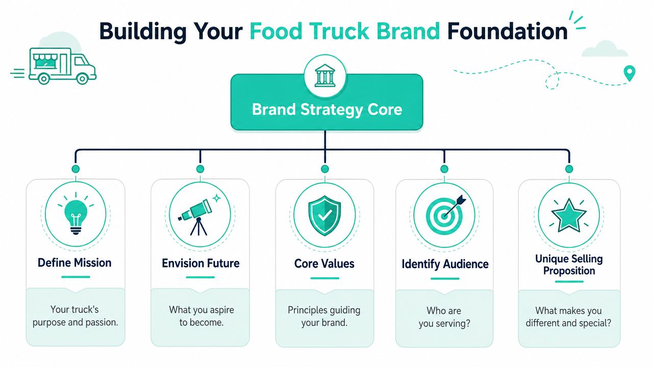
A practical food truck branding process starts with a written mission, a clear market position, a tone of voice, and a formal brand book. GloriaFood's guide recommends locking in the brand name, USP, mission statement, market position, tone of voice, logo, colors, and fonts so every customer touchpoint stays consistent, and it warns that branding before defining your niche leads to weak differentiation in this food truck branding guide.
Start with the promise, not the palette
Your first branding job is to define the promise. Not “we serve delicious food.” Every truck says that. The useful question is narrower: what specific experience are you promising, and for whom?
A strong foundation usually includes these decisions:
Mission statement One short statement that explains why the truck exists. Keep it human and specific.
Ideal customer Office lunch crowd, brewery crowd, families at school events, late-night bar traffic, health-conscious commuters. Each group responds to different naming, visuals, and menu structure.
Unique selling proposition This is your angle. Regional specialty, ultra-fast lunch format, chef-driven comfort food, allergen-friendly menu, breakfast-only concept, or a signature item people talk about.
Voice and personality Funny, bold, nostalgic, clean and modern, neighborhood-friendly, premium but casual. Your captions, menu descriptions, truck copy, and customer greetings should sound like the same business.
Before you finalize any of that, make sure you understand food truck licensing requirements. Branding and operations need to match. If local rules, commissary requirements, or location limits shape your service model, your positioning should reflect that reality.
Build a brand book before you print anything
Most new owners think a brand book is overkill. It isn't. It saves money because it prevents expensive revisions across the wrap, menu boards, uniforms, packaging, and website.
Your brand book doesn't need to be fancy. A simple shared document works if it includes the essentials. If you need a broader view of how strategy and messaging connect, this overview of brand development fundamentals is a useful companion.
Include these items in writing:
Brand element
What to decide
Name
Short, memorable, easy to say
USP
The single reason to choose you
Mission
Why the truck exists
Position
Where you fit in the local market
Voice
How you sound in writing and in person
Visual rules
Logo, colors, fonts, supporting elements
The best food truck brands feel obvious once you see them. That only happens because the owner made hard decisions early.
One more caution. Don't try to be for everyone. The trucks that blur together usually have broad concepts, generic names, and vague copy like “fresh flavors for every craving.” That sounds safe, but it gives customers nothing to remember.
Designing Your Visual Identity From Logo to Type
The usual advice is “get a cool logo.” That's incomplete. A food truck logo doesn't live on a business card first. It lives on metal, in sun glare, across a parking lot, and sometimes in motion.
The strongest commercial lever in food truck branding is distance legibility. Your truck name and core visual need to be readable in about two seconds from a moving car, and menus should be scannable in under 30 seconds, according to Elhaj Custom Food Trucks' branding guide. That's the standard I use when reviewing logo concepts for mobile businesses.
Your logo is a recognition tool
A good food truck logo has one job. It helps people recognize and remember you fast.
That means the best marks are usually simpler than owners expect. Strong options often include a bold wordmark, one distinct icon, and enough contrast to stay readable at distance. If you're refining the visual side with a designer, this guide to effective design systems for brands helps frame the bigger picture.
Use this test before approving a logo:
Shrink it mentally: Does it still make sense when seen from far away?
Remove the explanation: Will a first-time customer understand the mood or category without you talking?
Put it on multiple surfaces: Truck wrap, menu header, hat, profile photo, sticker.
A logo can be playful. It can be premium. It can be quirky. It just can't be confusing.
What usually fails on real trucks
I see the same design mistakes repeatedly, especially on first-time launches.
What works
What fails
Bold type
Thin script fonts
High contrast
Low-contrast color combinations
One visual idea
Three or four competing illustrations
Clean iconography
Tiny detail that disappears at distance
Name-first hierarchy
Slogan-heavy layouts
The biggest mistake is designing for taste instead of function. Owners fall in love with hand-lettered scripts, shaded effects, gradients, or complex badge logos because they look impressive on a laptop screen. On the side of a truck, they become noise.
Quick gut check: If your logo needs explanation, it's art direction, not branding.
Color choice matters too, but not because of generic color psychology clichés. On a food truck, color is mainly a visibility and category signal. Pick a limited palette that creates contrast, fits your concept, and holds together across wrap, menu boards, packaging, and social posts.
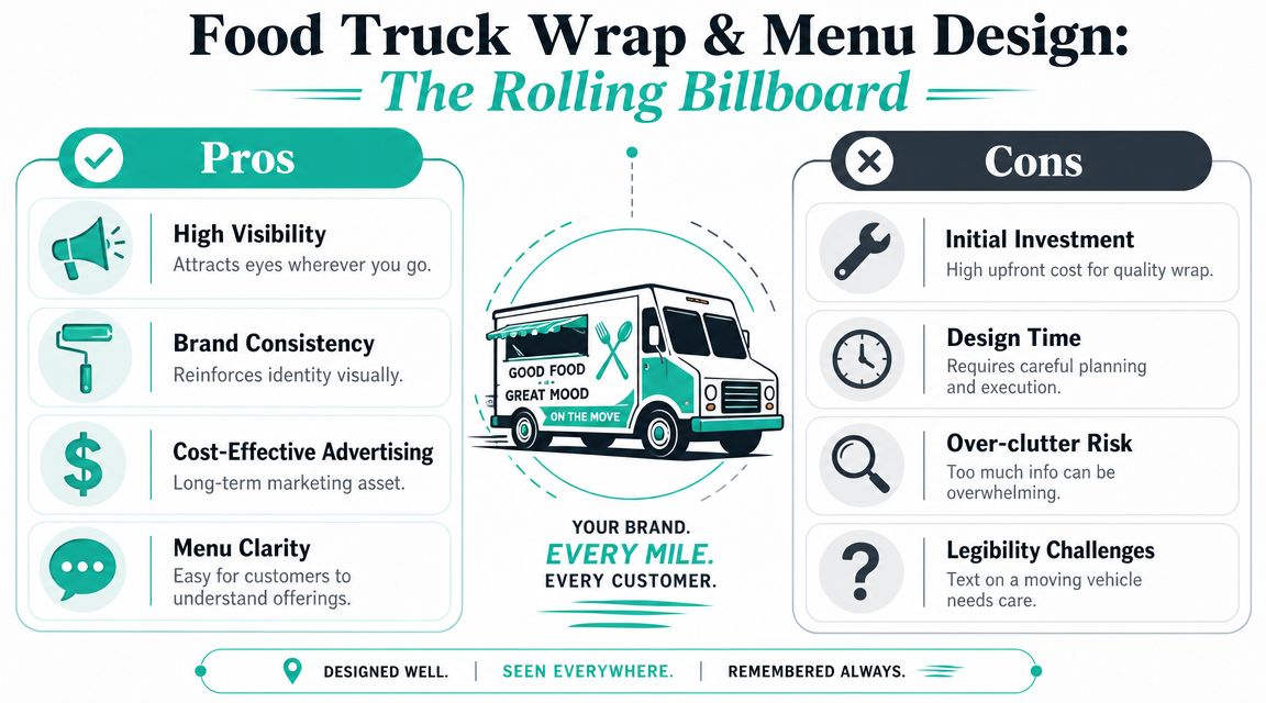
Your Truck as a Rolling Billboard Wrap and Menu Design
Your truck is your biggest marketing asset. It's also the place where owners most often overspend on bad design.
Expert guidance from WebstaurantStore emphasizes high-contrast, legible truck graphics, simple logos readable from a distance, and warns that overdesign, such as too many colors, decorative fonts, or inconsistent messaging, weakens recognition in their food truck marketing article. That advice lines up with what works at events and curbside stops.
Wrap for recognition first
A wrap is not a brochure. It should not try to tell your life story, show every menu item, and squeeze in every social handle at once.
The best wraps usually prioritize this order:
Truck name
What you sell
One visual hook
Secondary details only if space allows
If your truck says “Luna” in giant letters but never tells people whether you sell tacos, coffee, or desserts, the wrap failed. If it has six food photos, five fonts, and a paragraph about your chef background, it also failed.
Here's a practical checklist I give owners before wrap production:
Stand back test: View the mockup from far away. If the name disappears, enlarge it.
Category clarity: Add a plain-language food descriptor if the name alone doesn't communicate the menu.
One hero side: Choose one side of the truck to carry the strongest message hierarchy.
Don't wallpaper the surface: Empty space helps people notice what matters.
Keep digital consistency: Your website banner and social profile should resemble the truck, not feel like a separate business.
If you're also thinking through takeaway presentation, this piece on sustainable packaging branding is worth reviewing. Packaging extends the visual system after the customer walks away.
Menus need to move people forward
A menu board is a selling tool, not a full archive of everything you can cook.
When service slows, the menu is often the reason. Customers stand there comparing too many items, trying to decode clever names, or hunting for basic information. Good menu branding reduces hesitation.
Use a menu structure like this:
Menu decision
Better choice
Item naming
Clear first, clever second
Layout
Group by type or combo logic
Description length
Short enough to scan quickly
Typography
Large, simple, readable
Visual emphasis
Highlight bestsellers and easy-entry items
I usually recommend a visible “start here” path. That could be combos, signatures, or your three best-known items. Don't make first-time customers work hard.
A strong truck wrap gets people in line. A strong menu keeps the line moving.
Also think beyond the sale window. A photo-friendly service side, a clean handoff counter, and branded packaging all contribute to what people share online. Customers don't separate those details in their minds. They experience them as one brand.
Crafting an Unforgettable Customer Experience
Some trucks look sharp and still feel forgettable. The missing piece is usually the experience at the window.
Customers remember moments, not just visuals. They remember how the team greeted them, whether ordering felt smooth, whether pickup felt organized, and whether the brand personality stayed intact when the line got busy. That's where food truck branding stops being graphic design and starts becoming hospitality.
The service rituals people remember
The strongest truck brands usually have a few repeatable habits that make the interaction feel distinct.
One truck might greet every customer with a warm, fast recommendation instead of “What do you want?” Another might call out finished orders in a way that matches the brand voice. A breakfast truck might hand over drinks first so people have something in hand while they wait. A family-focused truck might keep the language playful and welcoming for kids.
Those choices sound small. They aren't. They create consistency, and consistency is what customers trust.
A useful exercise is to write down your service rhythm from line entry to food handoff:
Arrival moment: What does the customer see first?
Greeting: What exact tone does staff use?
Ordering help: How do you guide indecisive people quickly?
Pickup: Is the handoff organized and branded?
Goodbye: What line or prompt encourages the next visit?
If staff members all improvise the brand, the customer experience changes every shift. That makes the business feel unstable even when the food is good.
Packaging carries your brand after the sale
Packaging is where many trucks accidentally go generic. They spend on the wrap and then hand out plain containers with no thought to presentation.
Good packaging doesn't have to be expensive or elaborate. It should feel intentional. A sticker, stamped bag, consistent label style, short thank-you line, or branded napkin holder can be enough if it matches the truck's identity.
The key question is simple: does the food still look and feel like your brand once it leaves the window?
I've seen owners improve recall just by tightening the handoff. Cleaner labels, more consistent folding, and a simple branded message can make the order feel finished instead of merely packed. Customers notice polish, especially when they post photos or bring food back to an office.
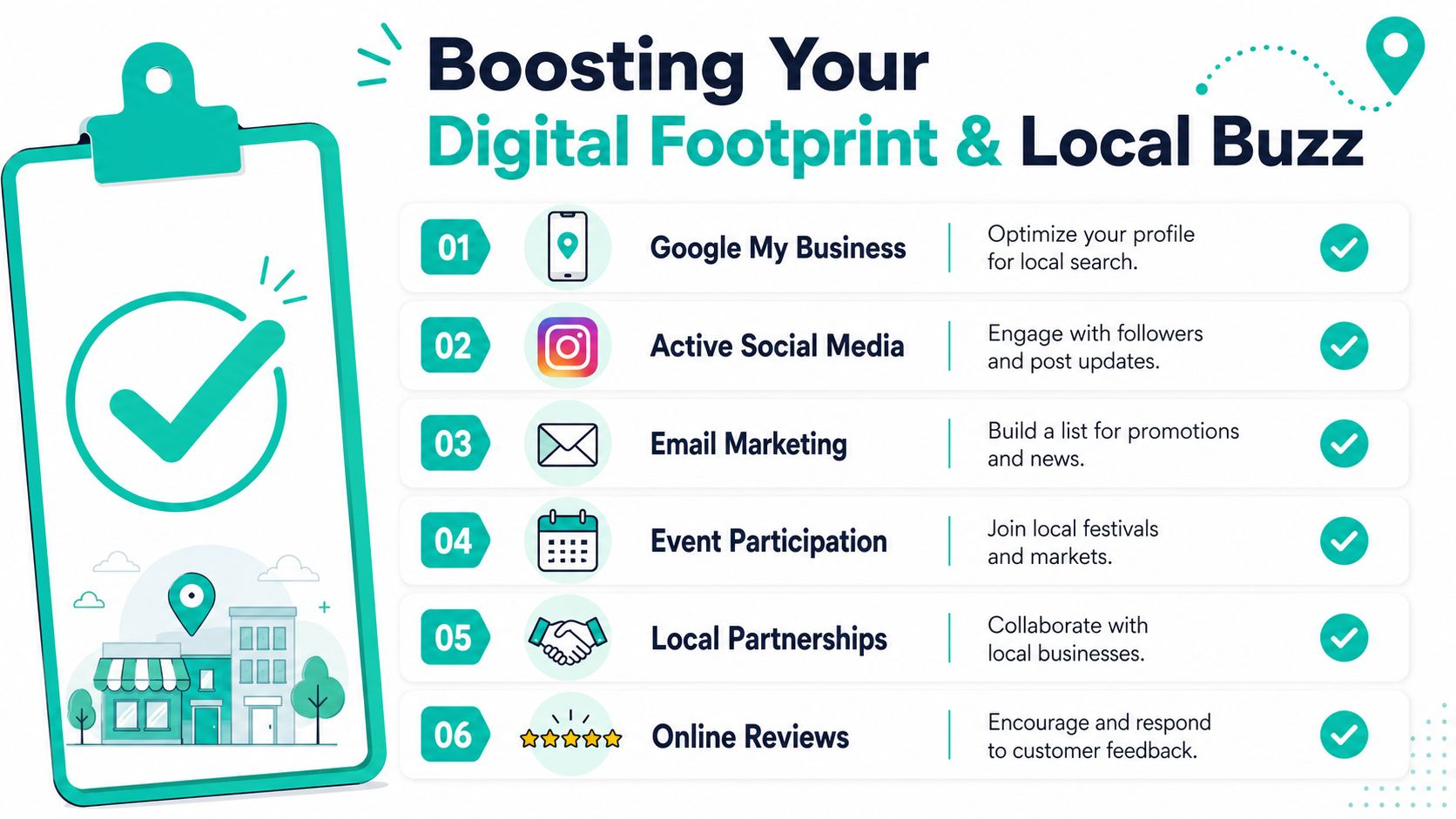
Building Your Digital Footprint and Local Buzz
Food truck growth has brought more competition to nearly every active market, according to Zippia's food truck statistics roundup. With more trucks on the road and in more cities, your digital presence needs to do one job well. Help hungry people find you fast and decide even faster.
A food truck that is hard to find loses sales before the first order. Customers should not have to hunt through old posts to confirm your location, guess whether you are open, or message you for a menu link. Good branding reduces that friction. It shortens the path from “I'm hungry” to “I'm in line.”
Be easy to find when people are ready to eat
I see this mistake constantly. Owners put real effort into the truck wrap, then leave the online side messy. The result is a brand that looks sharp at the curb but disappears the moment someone tries to look it up.
Your digital setup should answer five questions in seconds: where are you, when are you open, what do you sell, how much does it cost, and how do I book you?
Keep these assets aligned:
Website or landing page: Current menu, catering inquiry path, contact details, and photos that match the truck people will see in person.
Google Business Profile: Strong for branded searches, map visibility, and basic trust.
Instagram: Best for food photos, truck visuals, stories, and day-of updates.
Facebook or another event-friendly channel: Useful for community groups, event listings, and local shares.
Location posts: Every service day should include the place, hours, and any menu changes.
One more point matters here. Your digital brand should support service speed, not just awareness. If a customer can preview the menu, understand your top sellers, and see how ordering works before they reach the window, lines move faster and staff spend less time repeating basics.
Use content that reflects the real service experience
Post like an operator, not just a promoter.
A strong feed does more than announce locations. It shows what the experience is like. Feature your truck from a distance so people know what to look for in a crowded lot. Show your best-selling items clearly, not with dark filters or cluttered backgrounds. Pin a simple menu. Save story highlights for locations, catering, and FAQs.
This is branding as performance. Clear photos, recognizable colors, and consistent captions help customers identify you faster at events and make quicker decisions in line.
If every post looks different, customers have to re-learn your brand each time. That costs attention, and attention is expensive.
Use partnerships to multiply visibility
The strongest local buzz usually comes from repeated appearances with the right partners, backed by shared promotion.
A brewery night works better when both brands post before service, tag each other during the event, and share customer photos afterward. An office pop-up gets better turnout when the property manager has a clean graphic to email tenants. A school fundraiser performs better when your truck name, food photos, and event details are easy for organizers to copy without rewriting everything.
Build a simple partnership playbook:
Partnership type
Branding opportunity
Breweries
Co-branded event graphics and shared tags
Offices
Recurring lunch schedule posts
Markets and festivals
Pre-event teaser content and day-of location updates
Gyms or studios
Menu tie-ins that fit audience expectations
Community events
Familiar visuals that help returning guests spot you fast
Partners promote what is easy to share. Give them a current logo file, short brand description, approved food photos, and one clear version of your event details. When that package is ready, local buzz builds faster and your brand stays consistent wherever it appears.
How to Measure and Evolve Your Brand Over Time
A food truck brand keeps proving itself after launch. The true test happens during service, in parking lots, at festivals, and in repeat visits.
Strong operators measure brand health through customer behavior. Compliments about your wrap or logo feel good, but they are weak signals on their own. Track what the brand does for recognition, order speed, repeat business, and word of mouth.
Watch behavior at the window
Start with a simple field checklist for one full week. Have the person working the window tally four things during each shift:
Customers who walk up already knowing what they want
Customers who ask what kind of food you serve
Customers who misread your truck name or say it incorrectly
Customers who ask for a recommendation
That small log will show where your branding is helping and where it is creating drag. If a high share of customers reach the window without understanding your core offer, your truck graphics or menu headline are too vague. If recommendation requests cluster around the same few items, that usually means your menu hierarchy is doing its job. If people regularly shorten your name into a nickname you did not intend, decide whether to adopt that version or correct it across your signage and social profiles.
Use short questions that fit a live service environment:
How did you hear about us?
What made you stop today?
Did you know what we served before you got to the window?
What do you remember about the truck?
Keep these conversations brief. During a rush, long surveys slow the line and annoy customers. I usually recommend collecting answers during slower periods, then reviewing them alongside sales by location. If one brewery stop brings strong repeat orders and another brings lots of first-time confusion, the issue may be placement, lighting, menu visibility, or audience fit rather than the food itself.
Change with discipline
Most brand improvements should be small, clear, and easy to test. Raise contrast on the menu board. Enlarge the three best-selling items. Shorten a tagline nobody repeats. Remove visual clutter from one panel. Tighten the script your staff uses to greet guests.
Prioritize consistency over constant reinvention to build customer recall. Every unnecessary change to fonts, colors, tone, or product names makes customers work harder to recognize you next time.
A good review rhythm is quarterly. Ask three practical questions. Did people spot the truck fast? Did they understand the offer fast? Did the brand help them order fast? Those are useful standards because food truck branding has an operational job. It needs to get attention from a distance, reduce hesitation at the window, and support service speed once the line forms.
If your business needs sharper positioning, cleaner visuals, or a more consistent marketing system, Leaping Lemur Media helps brands show up with clarity and purpose. They focus on strategy that feels like you, not a generic template, which is exactly what strong branding requires.