Is Your Logo Still Working as Hard as You Do?
Your practice has evolved. You've sharpened your skills, built a team, and earned trust in your community, but your logo may still look like it belongs to an earlier version of the business. That gap matters because a before and after logo change is rarely just about style. It's about whether your brand looks current, credible, and aligned with how patients and clients choose providers now.
Logo redesigns have become common enough to be a real business decision. A widely cited branding benchmark says 78% of major brands have completed a logo redesign in the past five years, and the average refresh cycle is about once every seven years. The same dataset says brands that redesigned saw an average 15% increase in brand awareness within the first six months after launch, which is why smart owners treat a logo update as part of brand strategy, not decoration. You can also see the tension in consumer reaction, with some redesigns landing well and others sparking resistance, as shown by the Facebook and Slack preference split in branding surveys.
If you're weighing whether a redesign is worth it, the question is simple. Does the new mark solve a business problem, improve recognition, and help people trust you faster? This guide keeps the focus there, with practical takeaways for medical, dental, legal, and other practice owners who want a logo that works harder across websites, directories, signage, and social profiles. data-backed marketing strategies
Table of Contents
- 1. Services
- 2. Lure Creative
- 3. Connect Agency
- 4. Boston Web Partners
- 5. Catapult Strategic Design
- 6. Seedhouse Design
- 7. Logo Hammer
- Before vs After Logo, 7 Design Services
- From 'Before' to 'After': Your Next Steps
1. Services
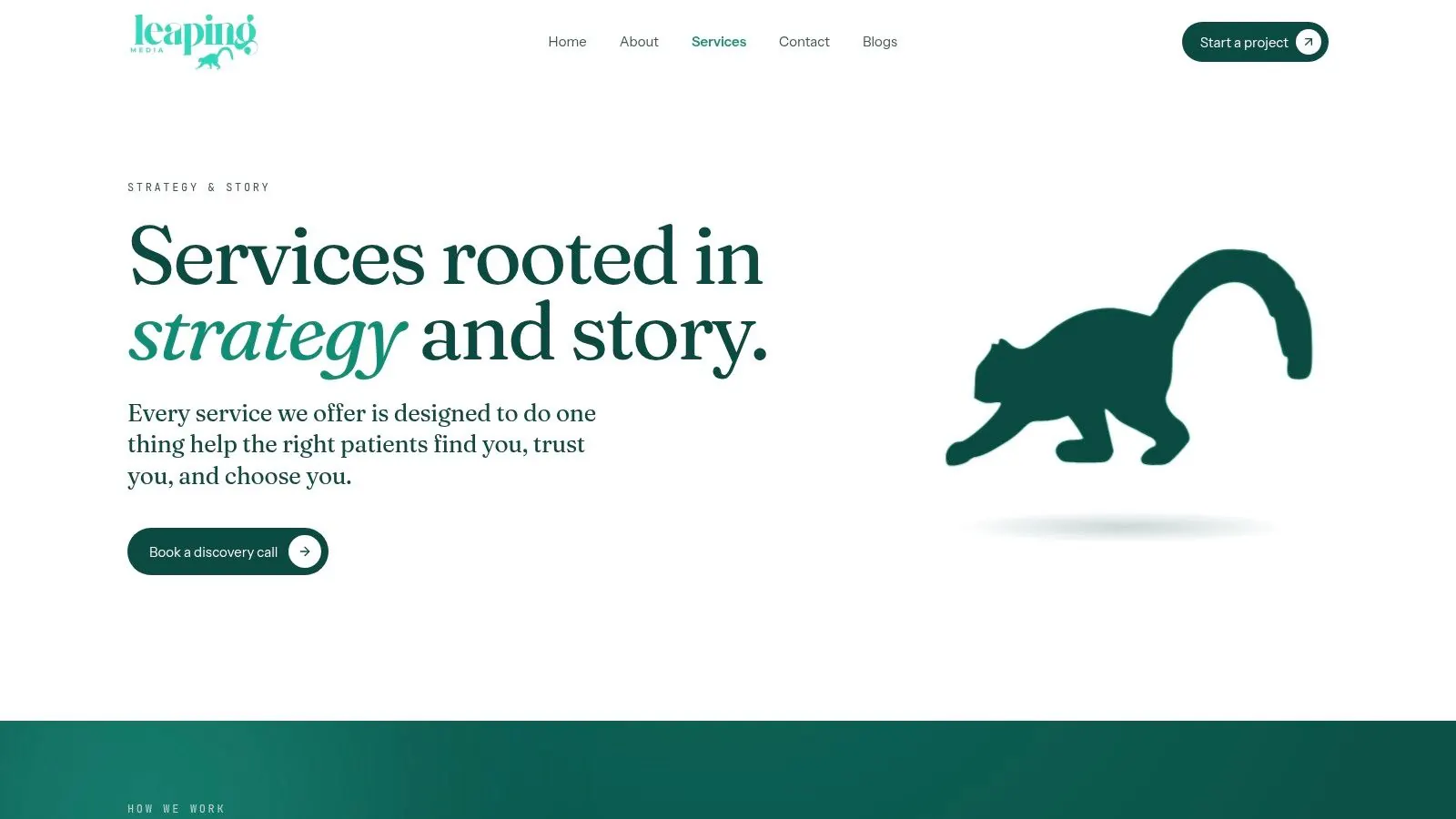
Leaping Lemur Media's Services page fits practice owners who want a before and after logo process that feels deliberate, not generic. The positioning is clear, marketing should feel like you on purpose, which is exactly what many dentists, eye doctors, medspas, and local firms are trying to solve when they outgrow an old mark. The emphasis on listening first, defining identity, and shaping authentic storytelling makes this a strong fit when the logo needs to reflect the way you serve your community, not just look trendy.
The biggest strength here is the partnership-first model. This is not a vendor that pushes a template and disappears. It's a long-term collaborator that stays close, helps refine the message, and builds a brand voice that can carry across websites, patient handouts, and social media without feeling pasted together.
Why practice owners should care
A lot of redesigns fail because the business team starts with aesthetics and ends with confusion. Leaping Lemur's approach starts with positioning, which is the right order for professional services. If you're a practice owner, that means the logo is being asked to do a real job, signal trust, reinforce specialty, and match the tone of the care or service experience.
Practical rule: if your current logo cannot be explained in one sentence that sounds like your practice, it's too generic to lead a redesign.
There's another benefit. The brand work is built around meaningful local connection, not traffic for traffic's sake. That matters because patients and clients don't choose on impression alone. They choose the practice that feels credible, familiar, and clear.
A strong logo isn't the whole brand, but it should make every other brand asset easier to trust.
You can see that philosophy carried across Leaping Lemur Media's journal, where the tone stays practical and strategy-led. For owners who want their marketing to sound more like a real practice and less like a brochure, that's the point.
Best for: practices that want identity work anchored in story, trust, and long-term consistency.
Not ideal for: businesses that want a fast, one-off logo swap with minimal strategic input.
2. Lure Creative
Lure Creative is a strong match for practices that want a before and after logo change tied to the rest of the patient journey. The agency's healthcare focus makes it especially relevant for medspas, clinics, and medical practices that need a new identity to support acquisition, not just sit on a letterhead. That matters because a logo on its own rarely fixes a weak digital experience. The brand, website, and messaging have to move together.
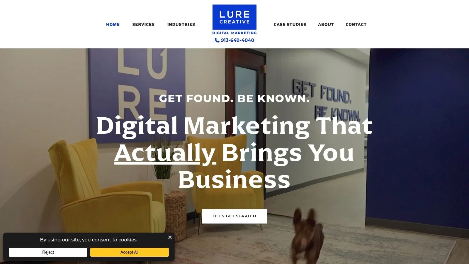
The strongest signal here is the full-funnel approach. If the logo changes but the website still looks dated, the result feels unfinished. Lure Creative's work pairs identity refreshes with website overhauls and content strategy, which is the right model for practice owners who need the new brand to support new business goals.
What to expect from a rebrand like this
The value of this kind of engagement is coordination. Your logo, homepage, service pages, and calls to action stop working against one another. That can help a practice project more confidence during the short attention span stage, when prospective patients are deciding whether to book or keep looking.
A useful source on evaluating redesign impact recommends comparing matched pre and post windows on business KPIs such as revenue, conversion rate, branded-search volume, and retention, while controlling for seasonality and promotions, using equivalent periods, a control group or A/B test when possible, and cohort analysis to isolate the redesign effect (best-practice measurement guidance). That's the right lens for a healthcare-facing redesign too. Don't ask only whether the logo looks better. Ask whether the new identity helps people move through the site and book with less friction.
The fit is especially good if your current brand feels disconnected from the quality of care you deliver. Lure Creative gives you a path from visual update to practical implementation, which is what most growing practices need.
Best for: medical and wellness brands that want identity and web improvements in one project.
Not ideal for: owners looking for a public price menu or an ultra-lightweight logo-only assignment.
3. Connect Agency
Connect Agency makes sense for professional-service practices that need a before and after logo refresh with more narrative weight behind it. Their law-firm work is useful because legal branding has to look confident without feeling flashy, and the logo often has to sit alongside a tagline, video, and a modern website. That combination matters for law firms, financial practices, and other service businesses where credibility is built through consistency across every touchpoint.
The value here is breadth. A logo redesign is only one piece of the signal. Messaging, visual identity, and site experience all shape whether a prospect trusts the firm enough to call. Connect Agency's published case studies show that they understand the entire stack, not just the mark itself.
Why this matters in practice
For professional services, the risk is usually not that a logo is ugly. It's that the identity feels generic, dated, or too soft for the level of authority the business wants to project. A brand refresh can fix that, but only if the rest of the materials keep pace. If the video style and website still look old, the new logo won't carry enough weight.
You should also think about recognition. Research summarized by Rice University warns that radical logo changes can create cognitive dissonance for committed customers, especially when the brand is already a household name, and it notes that rounded logos can reduce backlash during redesigns (Rice University on redesign backlash). That's useful guidance for firms with established reputations. If your brand already has equity, preserve the parts people recognize.
Connect Agency is a smart pick if you want the redesign to feel polished and complete, not experimental. The practical takeaway is straightforward, build the new logo as part of a wider identity system, then make sure the website, video, and messaging match the same standard.
Best for: law firms and professional practices that need a confident, multimedia-ready refresh.
Not ideal for: small medical offices that want deep healthcare specialization or transparent pricing.
4. Boston Web Partners
Boston Web Partners is a good fit when the before and after logo decision is inseparable from search visibility and lead generation. That combination matters for practices that depend on being found online first, then trusted quickly. A logo refresh without an SEO-aware website build can leave you with prettier branding and the same weak pipeline, which defeats the point.
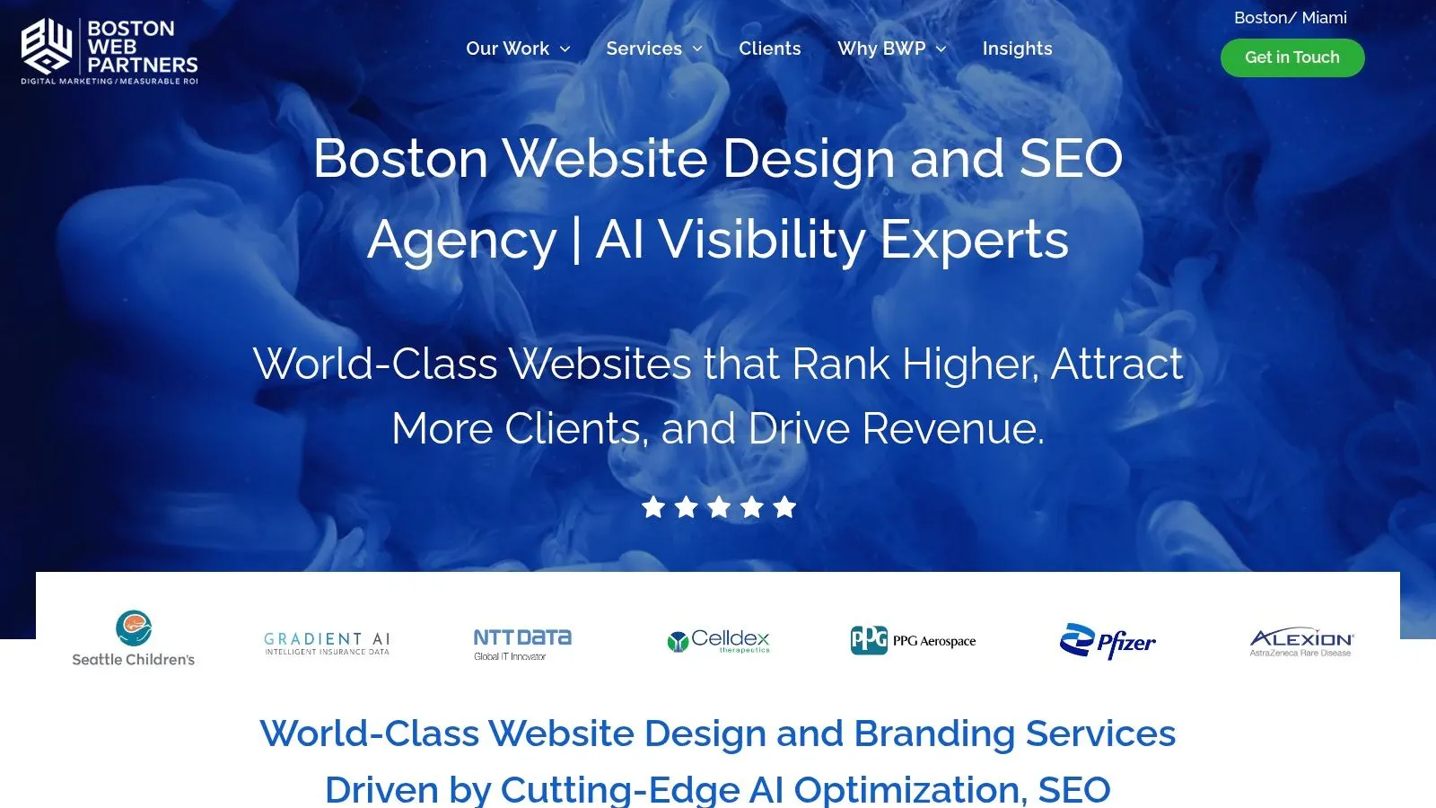
Their strength is the pairing of identity work with website modernization. That's especially useful for B2B-adjacent practices, healthcare companies, and firms that need a cleaner front door online. The focus on CMS usability and speed-to-launch also matters, because practice owners don't have time for a drawn-out branding project that sits in approval limbo.
Where this approach works best
If your current logo looks fine on paper but breaks down on a homepage, in search results, or on mobile, this kind of team can help. The problem often isn't the logo by itself. It's that the whole digital presentation feels misaligned. Boston Web Partners is built for businesses that want identity work to support discoverability and lead flow at the same time.
A controlled study of ten logo redesigns found that the new logos produced more branding seconds than the old ones in every case, and one example, Coors Light, improved from 0.64 to 0.85 branding seconds, a 33% increase (logo study). The same study reported that some redesigns also improved unaided recall. That's a useful reminder for owners. Better recognition does not happen by accident. It comes from a mark that reads quickly and works in context.
Leaping Lemur Media's services are worth comparing here if your main concern is brand voice and practice positioning rather than search-first execution. Boston Web Partners is the stronger choice when visibility and site structure are central to the redesign.
Best for: practices that want logo work tied directly to digital visibility and lead goals.
Not ideal for: owners who need a very deep, niche practice-brand strategy process.
5. Catapult Strategic Design
Catapult Strategic Design is for owners who need a before and after logo process that goes beyond the mark and into full brand architecture. That makes it a strong choice for organizations with multiple locations, layered service lines, or a need for clear governance. In other words, this is the right type of partner when the brand has to scale without losing control.
Their case studies show clear before and after identity work, but the core value is the strategic structure behind it. Naming, brand architecture, and governance matter when a practice grows or a firm manages several offerings under one roof. If the redesign only changes colors and a symbol, it won't solve the bigger consistency problem.
The strategic upside
This is the kind of partner you choose when you need the redesign to hold up over time. Brand architecture can prevent confusion across locations, departments, or affiliated brands. It can also protect the core identity while allowing room for future growth.
There's a lesson in logo history here. Stella Artois has kept the same logo for more than 656 years, dating back to 1366, which shows how powerful continuity can be when a mark has earned deep recognition (logo statistics). That doesn't mean every business should preserve everything. It does mean you should know what equity you're protecting before you redraw anything.
Catapult is best for practice owners who are making a serious strategic move, not just a cosmetic update. If you're expanding, re-structuring, or unifying a complicated brand family, this is the type of team that can build the system around the logo instead of treating the logo as the whole job.
Best for: complex organizations that need governance, naming, and scalable identity systems.
Not ideal for: smaller practices looking for a quick, affordable refresh.
6. Seedhouse Design
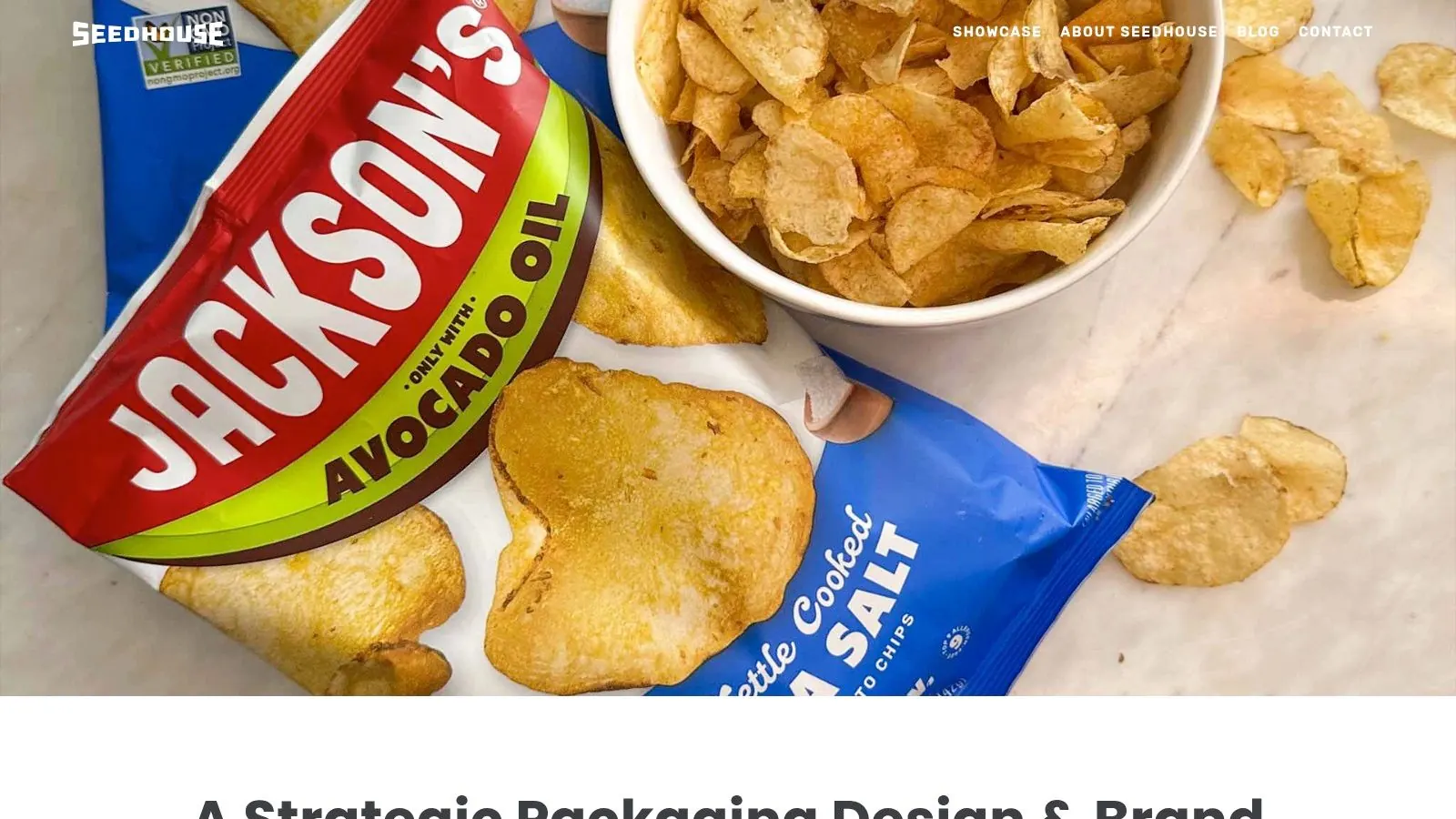
Seedhouse Design is a strong option when you want a before and after logo refresh that protects brand equity instead of wiping it out. That matters for heritage brands, established practices, and companies that have built recognition over years of steady service. Their work shows that modernization does not have to mean abandoning what people already know.
The value here is restraint. Seedhouse thinks in systems, which means the logo is designed to work across patterns, applications, and practical uses. For a practice owner, that's important because your brand has to live on appointments cards, storefronts, social profiles, and digital directories. A logo that looks nice only in one context is not a complete solution.
Why equity preservation matters
Consumers do react strongly to redesigns. A separate branding survey found that 80% preferred Facebook's old logo over the new one, while 73% preferred Slack's new logo over the old one (consumer preference survey). That contrast is the point. People don't always resist change itself, they resist change that feels disconnected from what they already trust. Seedhouse's approach is useful because it respects recognition while updating the system for modern use.
Leaping Lemur Media's about page makes a similar case for intentional, partnership-driven branding. If you value collaboration and want a redesign that keeps the personality of your practice intact, that philosophy will feel familiar.
The takeaway for practice owners is simple. If your current logo has equity, don't throw it away. Refine the structure, modernize the typography, and make it work better at small sizes and across channels.
Best for: established brands that want modernization without losing recognition.
Not ideal for: owners who want a highly experimental visual direction.
7. Logo Hammer
Logo Hammer is the most straightforward choice on this list for a before and after logo refresh on a tighter budget. It's built for small businesses and smaller practices that want clear packages, practical handoffs, and fast execution without a heavy strategy process. If you need a cleaner logo, a basic style guide, and assets you can use, this is the type of provider that keeps the project moving.
The biggest advantage is transparency. Public packages make the buying decision easier, especially for solo practitioners and small office teams that don't want a long discovery cycle. The practical deliverables also matter, because the core challenge after a redesign is usually asset management. Your team needs files, brand guidance, and versions that work in the world.
What small practices should watch for
This kind of service is best when you already know the business problem. Maybe the old logo looks dated, maybe it scales badly on social icons, or maybe the business needs a cleaner mark before opening a new location. If the strategy is already clear, a more execution-focused provider can be exactly right.
A useful benchmark for logo work says that by 2024, 50% of established brands were expected to redesign every five years, which reflects how often identities now need to stay current across digital channels (logo statistics). That doesn't mean everyone should rebrand constantly. It means small practices need a logo that holds up in more places than a storefront sign ever did.
If you want a budget-friendly path, Logo Hammer is the practical pick. If you want deeper positioning work, choose a partner that starts with strategy before design.
Best for: smaller practices that want affordable, usable logo updates.
Not ideal for: complex brands that need deep positioning or long-term brand architecture.
Before vs After Logo, 7 Design Services
| Provider | 🔄 Implementation Complexity | ⚡ Resource & Speed | ⭐📊 Expected Outcomes | Ideal Use Cases | 💡 Key Advantages |
|---|---|---|---|---|---|
| Leaping Lemur Media (Services) | Moderate–High, strategy-led, iterative partnership | Higher resources; longer timelines ⚡⏳ | ⭐⭐⭐⭐, stronger brand trust, sustained community engagement 📊 | Practices seeking mission-led, long-term marketing partnerships | Partnership-first, identity-led, community focus |
| Lure Creative | Moderate, full-funnel identity + web work | Moderate resources; measured timelines ⚡ | ⭐⭐⭐⭐, improved conversions and patient acquisition 📊 | Medical practices, medspas, clinics focused on growth | Healthcare-centric creative; outcome-focused case studies |
| Connect Agency | High, comprehensive rebrands with multimedia | Higher resources; includes video & web production ⚡ | ⭐⭐⭐⭐, confident, multimedia-enabled identity refresh 📊 | Law firms and professional services seeking bold refreshes | In-house video/website production; legal case studies |
| Boston Web Partners | Moderate, logo + SEO-friendly site builds | Moderate resources; emphasis on speed-to-launch ⚡ | ⭐⭐⭐⭐, improved visibility and lead generation 📊 | Practices needing identity aligned with SEO and leads | SEO-minded builds, CMS usability, quick launches |
| Catapult Strategic Design | High, full brand architecture and governance | High resources; longer lead times ⚡⏳ | ⭐⭐⭐⭐, scalable brand systems and governance 📊 | Public sector, CPG, organizations needing governance | Deep strategy, brand architecture, naming capabilities |
| Seedhouse Design | Moderate–High, equity-preserving identity work | Moderate resources; deliberate process ⚡ | ⭐⭐⭐⭐, modernized identity while retaining recognition 📊 | Heritage brands, industrial, enterprise clients | Equity-preserving redraws, system thinking, application guidance |
| Logo Hammer | Low, execution-focused, template-enabled | Low resources; fast turnaround ⚡⚡ | ⭐⭐⭐, affordable logo refreshes; quick tangible deliverables 📊 | Small businesses and practices on tight budgets | Transparent pricing, quick delivery, practical file handoffs |
From 'Before' to 'After': Your Next Steps
Seeing these examples makes one thing clear, a successful before and after logo redesign is about strategy, not just style. It has to tell the right story to the right people, in the places where they meet your practice. That means websites, social profiles, directories, signage, and printed materials all need to support the same promise.
Before you change anything, define the business problem. Are you trying to look more current, reduce confusion, support a new service line, or create consistency across channels? Once that's clear, compare your current logo against how people see you now, not how you looked when the business started. If the mark no longer matches your level of care or professionalism, the redesign conversation is already overdue.
This is also where evidence matters. Use the same measurement window before and after launch, compare the right KPIs, and keep the process auditable with consistent screenshots and assets. That approach turns a subjective design conversation into a real business decision, which is exactly how practice owners should handle it. For a reminder on the value of current, usable brand assets, see top logo font detection tools.
If you're ready to make the next version of your brand feel as intentional as the care or service you deliver, start with a partner who listens first and builds with purpose. That's how a logo becomes more than a visual update. It becomes a signal that your practice is trusted, current, and ready for what's next.
Leaping Lemur Media helps practices turn a logo change into a clear brand decision, not a guessing game. If you want a before and after logo process that reflects your practice, your community, and your growth, visit Leaping Lemur Media and start the conversation with a team that builds with intention.