
Brand Positioning and Strategy That Makes Practices Chosen
Brand positioning for practices: clarify who you help and why patients should choose you over similar providers nearby.
Read

Brand
You're probably in one of two spots right now. Either your practice has a logo, a website, and a pile of marketing pieces that don't quite match, or you're about to hire someone and you're worried about paying twice for disconnected work.
That concern is justified.
Most small practices don't have a branding problem or a website problem. They have an integration problem. The brand says one thing, the site suggests another, the office experience delivers a third, and the patient or client is left to guess which version is real. People make that judgment fast. A Stanford Web Credibility review cited by Clutch found that 83% of users judge a website's credibility in under 20 seconds, with 28% judging almost immediately and 55% within 10 to 20 seconds according to Clutch's summary of the Stanford review.
If you run a dental office, optometry practice, medspa, law firm, or any trust-based local business, branding and website design should be handled as one system. Not two vendors. Not two timelines. Not two opinions fighting in your homepage hero.
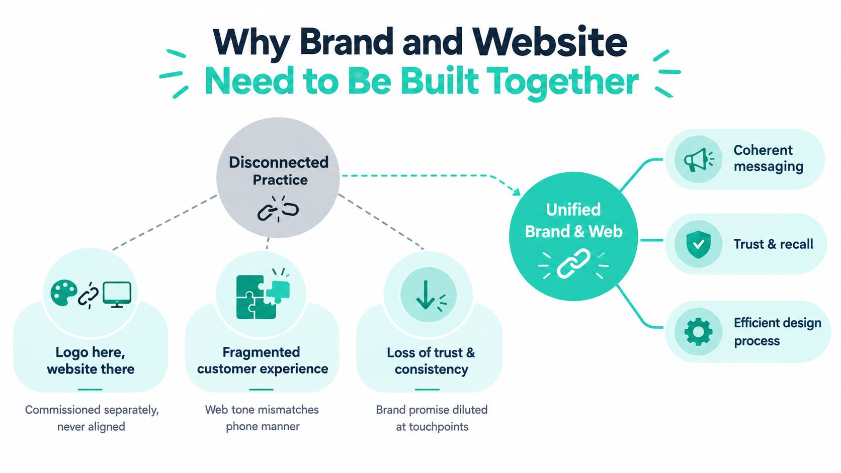
The most common mistake I see is simple. A practice hires a designer for a logo, then hires a developer for a website, then asks the front desk to “make it sound friendly.” That's how you end up with a polished site that still feels off.
First, the tone shifts page to page. Your homepage sounds premium. Your service pages sound generic. Your contact page sounds abrupt. Visitors notice even if they can't explain it.
Second, the visuals don't match the world experience. If your office feels calm and professional but the site feels loud, trendy, or cluttered, people feel friction before they ever call.
Third, your offers contradict your positioning. A practice that wants to be known for expertise and careful guidance can't splash bargain-bin language across every page and expect to keep authority intact.
Practical rule: If your About page, your Google Business Profile, your intake flow, and your phone greeting don't reinforce the same promise, your marketing is leaking trust.
That trust loss isn't abstract. Website presentation plays a direct role in credibility. In a review of web credibility research, nearly 75% of respondents said they judged a website's credibility from content presentation, with design/look at 46.1% and information design at 28.5% as the biggest categories in the credibility review published by PMC.
Build in this order:
Define positioning first
Decide what the practice stands for, who it serves best, and why someone should choose it.
Write the verbal identity next
Set the tone, vocabulary, claims, and message hierarchy.
Design to express that identity
Color, type, photography, layout, and calls to action should support the positioning, not fight it.
Build the website as the operating system
The site should deliver that promise consistently across every page and device.
A lot of practice owners need an outside perspective here. A useful starting point is reviewing how an agency frames its own philosophy and process on its about page. If the thinking is vague there, the work will be vague too.
Some elements need hard rules. No improvising.
Other areas benefit from controlled variation.
That's the lens for every decision that follows.
Don't start with colors. Start with decisions.
Give yourself 30 quiet minutes and answer three questions on paper, not in your head.
That last answer matters more than owners think. If you want people to say “they explain everything clearly” but your site sounds stiff and overloaded, your brand promise dies on contact.
Write one sentence using this formula:
For [audience] who [need], we [promise] unlike [alternatives].
Examples:
Keep it tight. If the sentence is bloated, your positioning isn't ready.
Local practices usually serve more than one decision mode.
Some visitors are making a transactional decision. They need an eye exam, a teeth cleaning, a consult, a contract review. They want clarity, availability, and next steps.
Others are making a considered trust decision. Cosmetic dentistry, medspa treatments, specialty eye care, estate planning, injury representation. They need proof, reassurance, process, and confidence in your judgment.
Those two audiences should not hit the same homepage promise in the same way.
Your homepage headline should reflect the highest-value audience you most want, while the page structure still lets lower-friction visitors find what they need fast.
Mine three places for real wording:
Front desk objections
What do people ask before booking? Insurance, pain, downtime, cost, timing, results, parking, urgency.
Online reviews
Pull repeated phrases. Patients often tell you your differentiator more clearly than you do.
Referral language
Ask current referral sources how they describe your practice when recommending you.
Then choose one primary attribute and one secondary attribute for the brand.
Examples that work:
Examples that don't help:
Those are table stakes. They don't direct a website.
| Positioning Attribute | Tone Cue | Visual Cue | On-Site Proof |
|---|---|---|---|
| Clinical authority | Precise, calm, no hype | Clean spacing, restrained palette, structured layouts | Credentials, treatment process, FAQs |
| Warm education | Clear, conversational, patient-first | Softer imagery, friendly faces, simple diagrams | Explainers, review excerpts, team intros |
| Premium concierge | High-touch, polished, selective | Elegant typography, minimal clutter, strong photography | White-glove process, amenities, consultation flow |
| Community-rooted | Human, local, grounded | Real office images, neighborhood references | Local involvement, team stories, location detail |
Once you've got the attributes, the rest gets easier. Those attributes become your tone rules. Those tone rules become page headers, calls to action, photo direction, and layout choices.
Small practices usually overcomplicate this part. They collect moodboards, explore twelve fonts, and debate shades of blue while the messaging is still mush.
Pick a voice profile. Lock the basics. Move.
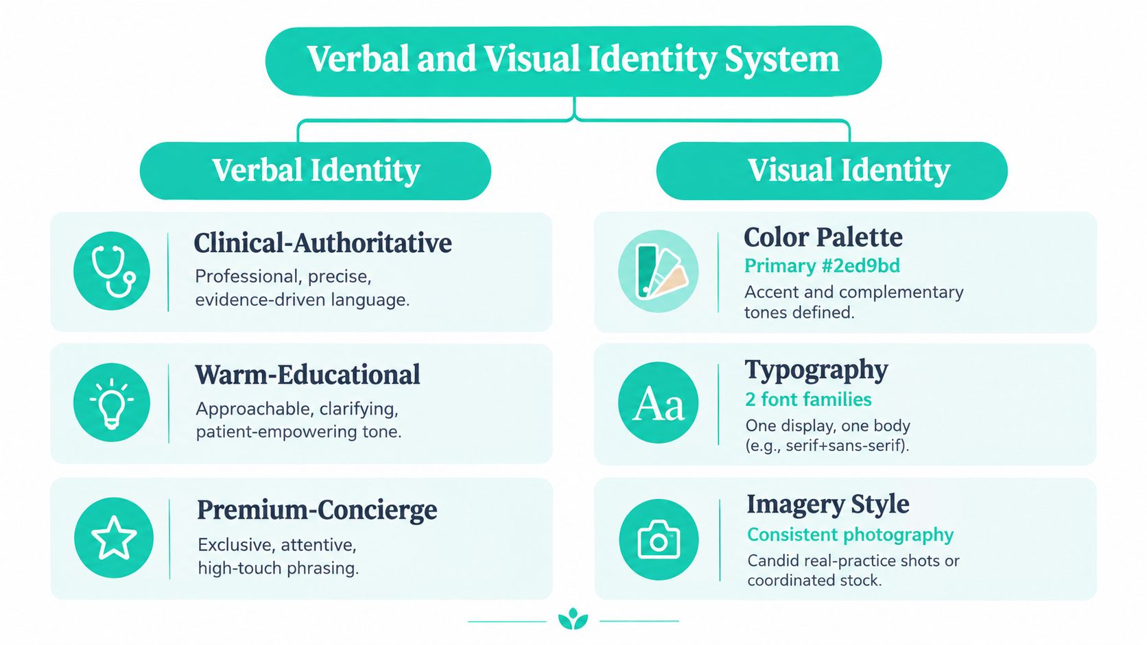
Most practices fit one of these three verbal identities:
Use this if your edge is expertise, precision, safety, or complex decision-making. Common for specialists, legal practices, and medically oriented medspas.
The tone is disciplined. Short sentences. Clear claims. No jargon unless the page also translates it.
Use this if your patients need reassurance and explanation before they commit. Great for family practices, general dentistry, optical, and consult-heavy services.
The tone is calm and clarifying. You're still the expert, but you sound like a person.
Use this if the experience itself is part of the sale. Cosmetic services, boutique firms, high-touch elective care.
The tone is polished and selective. Not snobbish. Just deliberate.
Write web copy in second person, keep paragraphs short, and never invent credentials, outcomes, or authority you can't prove.
Your naming system should work across navigation, service pages, ads, and search.
Bad examples:
Those names might sound clever in a meeting. They're weak on a website because they hide intent.
Better:
You can keep a brand-friendly tagline, but service-line naming needs to stay searchable and immediately understood.
For most local practices, these defaults work:
If you need a practical reference for keeping typography usable across website pages, PDFs, signage, and social assets, this scalable brand typography guide is a solid framework.
Your brand system isn't separate from UX. It shows up in:
There's a business reason to stay disciplined here. Research summarized by Intechnic from Lucidpress and Marq found that consistent brand presentation across channels is associated with roughly 10 to 33% revenue lift, and 68% of respondents in one study attributed 10 to 20% of revenue growth to consistency in this UX and branding statistics roundup.
That doesn't mean every page should feel robotic. The system should lock down your promises, palette, typography, and CTA treatment. It should leave room for human proof through team photos, provider bios, office details, and real patient language.
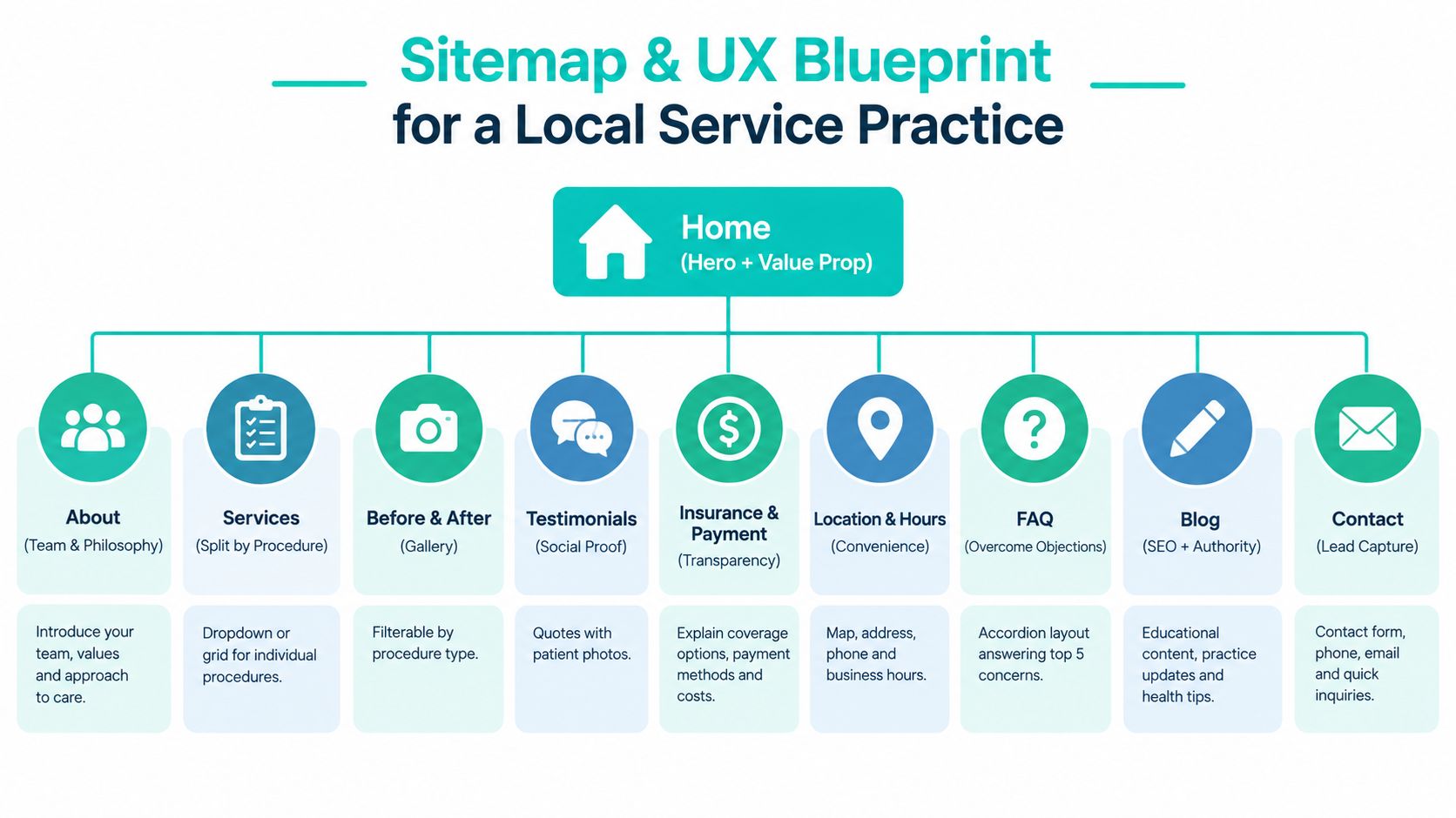
A good brand still fails if the site architecture is messy. Local practice websites should be shallow, obvious, and easy to scan.
If users can't find what they need quickly, design quality won't save you. HubSpot's benchmark notes that 72% of business websites were graded 59/100 or lower, and it recommends a practical process of auditing task paths, simplifying the homepage, and testing friction points like navigation and content clarity in this website design optimization analysis.
Most practices need 8 to 12 top-level pages. Keep it simple.
Don't bury key services under vague umbrella pages. Split service pages by procedure or practice area.
Here's the standard I use:
| Page | Primary job |
|---|---|
| Home | Earn trust fast and direct the next click |
| Services | Build intent and answer practical objections |
| About | Close the likability gap |
| Reviews | Reduce social risk |
| Resources | Educate and support search visibility |
| Contact | Remove friction completely |
That single-job rule keeps pages from turning into junk drawers.
Your mobile visitor is often in a hurry. Design accordingly.
If you want a decent overview of how these decisions fit into the larger production sequence, this full website building process is useful context for owners hiring out the work.
For service businesses, first impressions come from presentation more than reputation alone. That means your homepage should do a few things immediately:
Allow more human variation on the About and Reviews pages. Keep the layout logic, button treatment, and core visual system locked. That balance is what makes branding and website design feel alive instead of staged.
If you need outside implementation support, some agencies build both the brand system and the site structure together. Leaping Lemur Media's services are one example of that combined scope.
A good design can still die in development. That usually happens because the handoff is sloppy, the SEO basics were treated as optional, or the build ignored performance until launch week.
Your Figma or Sketch file should include named layers, reusable components, and a clear spacing system. I prefer an 8-point spacing system because it keeps interface decisions consistent without slowing the developer down.
At minimum, hand off export-ready components for:
Add a style sheet with hex values, font weights, form states, button states, and usage notes. Developers shouldn't have to guess what “close enough” means.
If your team hasn't done this well before, a practical developer handoff guide can tighten the process.
SEO isn't a separate phase. It belongs inside the build.
Use these defaults:
| Decision | Default | Trade-off |
|---|---|---|
| Keyword targeting | One clear intent per URL | Broader pages feel simpler but rank worse and convert worse |
| Schema | LocalBusiness plus the relevant service schema | Takes developer time but improves clarity for search engines |
| Title tags | Keep them under 60 characters | Shorter titles force discipline |
| Meta descriptions | Lead with payoff and relevance | Requires actual messaging decisions, not filler |
| Alt text | Add it to every meaningful image | More production work, better accessibility and context |
| Internal links | Point blog and resource content back to service pages | Needs editorial planning |
This isn't a technical side note. Slow sites feel less trustworthy, no matter how nice they look.
Google's mobile guidance says to prioritize rendering above-the-fold content in under one second for an optimal experience, reported an average mobile page load of 15.3 seconds in its benchmark, and recommended 5 seconds or less on mobile devices using 3G in Google's mobile speed guidance.
Those numbers tell you exactly what to care about. Compress assets. Reduce render-blocking elements. Get the first visible viewport loaded fast.
For infrastructure, choose hosting that supports HTTP/2, Brotli, and a CDN. Lazy-load below-the-fold media. Test on real devices, not just a designer's MacBook on office Wi-Fi.
Three decisions should be approved in writing before development starts:
That written approval prevents avoidable rebuilds and keeps the brand intact from mockup to launch.
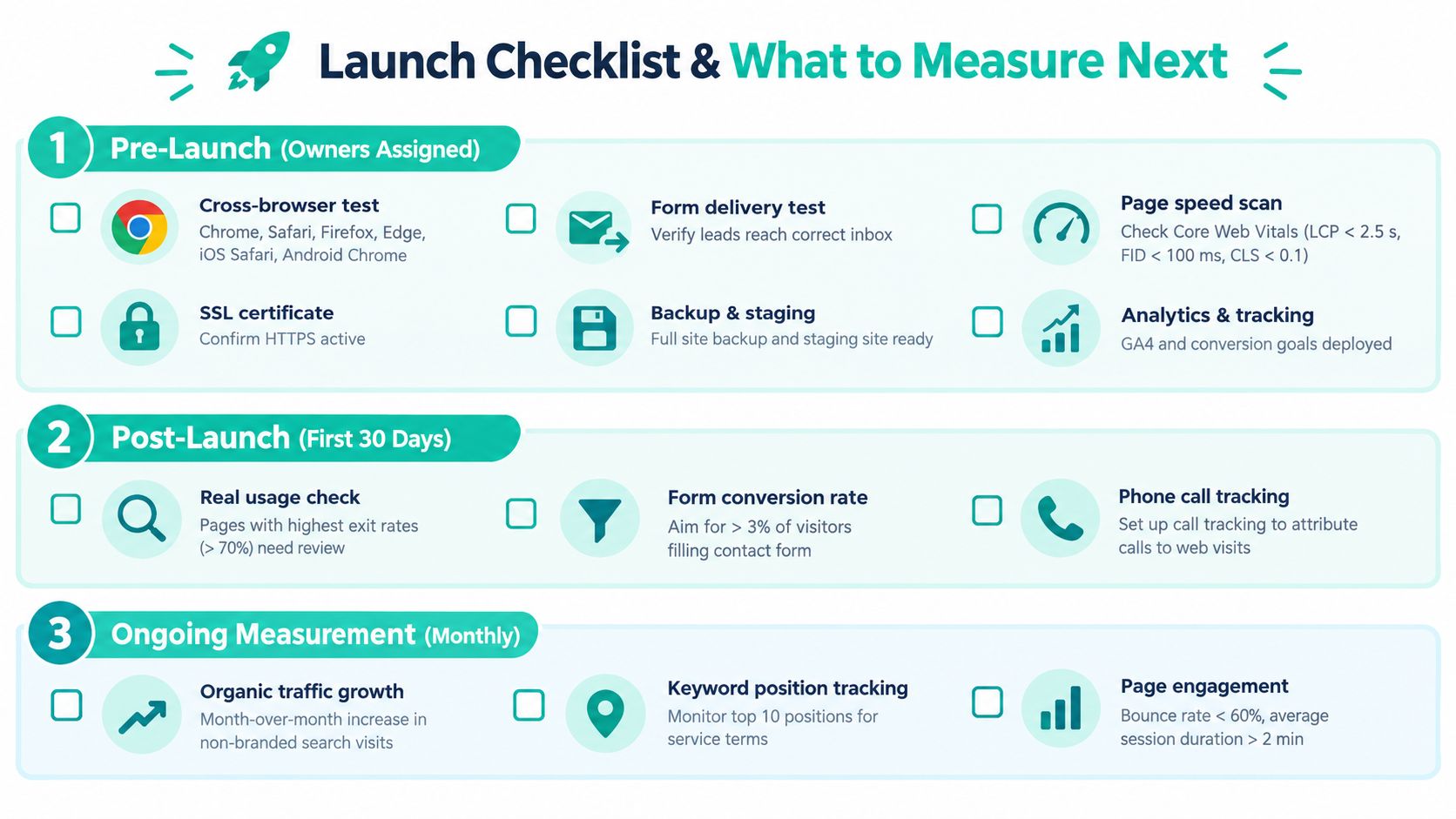
Launches go sideways when nobody owns the checklist. Assign names to tasks. Don't run this by vibe.
Before the site goes live, verify the basics manually.
If a contact form fails on day one, the redesign didn't launch successfully. It launched broken.
The first 30 days are not the time to obsess over vanity metrics. Watch three things:
Speed belongs in this review too. Google reported that 53% of mobile visits are likely to be abandoned if pages take longer than 3 seconds to load, one out of two people expect a page to load in less than 2 seconds, and 46% of people dislike waiting for pages to load more than anything else on mobile in Google's mobile speed benchmark summary.
That's why the first visible experience matters so much. If the page stalls, your brand promise never gets delivered.
By day 30, identify the two weakest service pages and rewrite them with stronger proof. Add clearer headings, tighter FAQs, better images, or more direct next steps.
Use the first 90 days to answer practical questions:
Practice owners who want ongoing benchmarks and implementation ideas can keep learning from the Leaping Lemur Media journal, especially if they're refining the site after launch rather than rebuilding again in a year.
Most branding and website design projects go off track because the inputs were vague. “Make it modern” is not a brief. “We want more high-value consults from families within driving distance who care about clarity and trust” is a brief.
Use this as your baseline before you hire anyone:
Run through this list before approving strategy, design, or launch.
Treat that brief like a living contract with any agency or freelancer. If the brief is fuzzy, the deliverables will be fuzzy too. The template gives structure, but you still own the decisions inside it.
Leaping Lemur Media helps practices align brand strategy, messaging, and website design so the site reflects how the business should be perceived and chosen. If you want a partner who can turn positioning into a credible, fast, conversion-focused web presence, visit Leaping Lemur Media.
Brand positioning for practices: clarify who you help and why patients should choose you over similar providers nearby.
Why brand guidelines matter for growing practices: keep your logo, voice, and visuals consistent across web, social, and print.

Only 4% of new legal business is won on price. How law firm brand positioning builds the reputation and trust that actually wins clients.
Enough reading
If a dispatch struck a nerve, that's usually the start of a project. Tell us what's broken — we'll tell you honestly whether we can help.