A prospective patient searches for a dentist, opens several practice websites, and finds the same visual shorthand everywhere: a blue tooth, a curved smile, and a clean sans-serif name. Nothing looks wrong, but nothing feels memorable either. In that crowded moment, your dental logo design has a practical job. It must help patients recognize your practice, understand what kind of experience you offer, and feel confident enough to take the next step.
A trustworthy logo isn't created by decorating a tooth icon. It comes from positioning, restraint, legibility, accessibility, and a visual story that belongs to your practice.
Table of Contents
- Why Your Dental Logo Matters More Than You Think
- Define Your Brand Strategy Before You Sketch
- Crafting Visual Concepts That Build Trust Without Clichés
- From Sketch to Scalable Logo System
- Budgeting Timelines and Working With Designers the Smart Way
- Test Protect and Launch Your New Dental Logo With Confidence
Why Your Dental Logo Matters More Than You Think
A prospective patient may see your practice for the first time on a referral card, a search result, or the sign outside your building. In each setting, the logo appears before a detailed explanation of your care. If it looks like every other dental office, the quality of your team can disappear behind a familiar blue tooth and generic wordmark.
Compare two practices in the same neighborhood. One uses a standard tooth outline and applies it differently across its website, sign, staff materials, and social profile. The other uses a distinctive symbol tied to its community, a readable name, and a consistent visual system. Both may offer excellent dentistry. The second gives patients a clearer reason to remember it.
A logo is a trust signal
Healthcare branding research shows that visual choices influence perceived credibility, not only aesthetic appeal. In one healthcare logo study, average trust ratings ranged from 5.78 in one category to about 5.01 in another. The difference does not make a logo a substitute for good treatment, clear communication, or a welcoming team. It does show that the first visual impression can support or weaken the confidence those strengths need to build.
The same source reports that 88% of patients identify authenticity and honesty as the most important factors in earning trust, and that consistent visual elements across touchpoints can increase patient trust by up to 30%. Treat those findings as a practical warning. A polished logo cannot repair a poor patient experience, while inconsistent branding can make a capable practice feel less considered.
Practical rule: Your logo should make the right promise before a patient reads the rest of the page.
That promise may involve gentle pediatric care, advanced cosmetic dentistry, family continuity, a premium experience, or a strong community connection. The mark cannot explain every service. It can establish the emotional direction and give the rest of the brand a clear starting point.
Familiar isn't always reassuring
Tooth and smile symbols are easy to recognize, which explains their popularity. Recognition alone, however, gives patients little reason to remember one practice instead of another. Dental branding perspectives from Brandframer discusses alternatives such as custom typography, abstract trust geometry, emotional storytelling, responsive formats, and locally specific cues.
Responsive design matters in practice. A logo must remain legible on exterior signage, appointment cards, social avatars, and a browser favicon. Accessible contrast and a useful one-color version also prevent the identity from failing in smaller or less controlled applications.
At Leaping Lemur Media, the working philosophy is that marketing should sound like the practice on purpose. The visual identity should follow the same principle. Our approach to brand work focuses on expressing a practice's character rather than copying the category.
Dental logo design isn't a finishing touch added after the strategy. It is one of the first ways patients experience the strategy. A story-driven, distinctive system can make trust visible before the first appointment.
Define Your Brand Strategy Before You Sketch
Starting with a sketchbook is tempting because the visual part feels tangible. It also creates a common problem: the designer develops an attractive symbol before anyone has agreed on what the practice needs to communicate. Later, every revision becomes a debate about personal taste because there isn't a shared strategic standard.
Write the words first. A useful creative brief can fit on one page and should answer five questions:
- Who should feel immediately understood? Define the primary patient group, such as families with young children, adults seeking cosmetic treatment, anxious patients, older adults, or a broad local population.
- What experience are you promising? Use observable language. “Calm appointments with clear explanations” gives a designer more direction than “high quality.”
- What makes the practice meaningfully different? Consider continuity of care, a specialty, technology, community roots, accessibility, a particular philosophy, or the way your team communicates.
- Which competitors should the identity avoid resembling? Collect local screenshots and note recurring colors, symbols, typefaces, and layouts.
- What three words should the logo communicate at a glance? Choose words that describe the patient experience, not internal ambitions.
Turn positioning into visual direction
Suppose your practice focuses on gentle pediatric dentistry. Your brief might prioritize warmth, confidence, and growth. That doesn't require cartoon teeth or childish lettering. A rounded custom symbol, a friendly but highly legible typeface, and a restrained palette could communicate care without making the practice look less clinically credible.
A cosmetic practice may need refinement, precision, and confidence. A neighborhood family practice may need familiarity, welcome, and continuity. A specialist may need authority and focus. The same dental symbol can't communicate all of those equally well.
Your brief should also define where the logo will appear. List the website header, mobile navigation, exterior signage, business cards, treatment materials, uniforms, social avatars, referral documents, and digital advertising. A design that works only as a wide horizontal lockup will create problems when a square profile image or small mobile header requires a different configuration.
Make decisions before opinions multiply
Assign one person to consolidate feedback. Ask reviewers to judge each concept against the three chosen words, the audience, differentiation, and real applications. “I like this color” is valid personal feedback, but it isn't a strategic reason to approve a logo.
For practical support with brand positioning, identity development, and healthcare-focused marketing, review Leaping Lemur Media's services. The key deliverable at this stage isn't a finished mark. It's a clear set of decisions that makes the finished mark easier to evaluate.
Crafting Visual Concepts That Build Trust Without Clichés
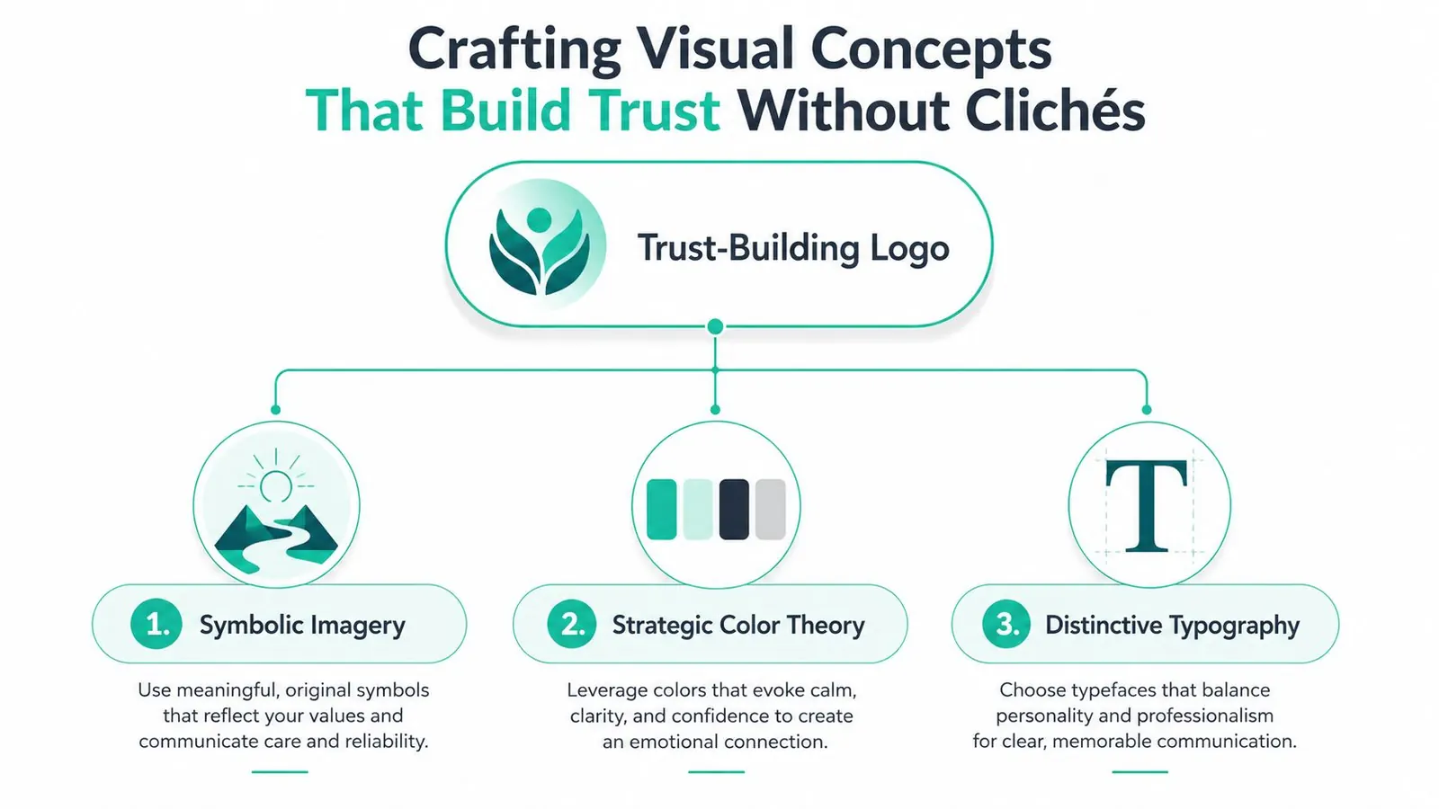
The strongest concepts usually begin with a patient experience, not a dental object. Ask what the practice helps people feel: safe, understood, restored, prepared, confident, or connected. Then look for visual metaphors that can express that feeling without drawing an obvious tooth.
A practice rooted in a particular neighborhood might use a simplified local landmark, natural form, or architectural rhythm. A practice focused on anxiety-aware care might explore shelter, openness, or a steady geometric structure. A specialist might use a precise abstract form that suggests alignment or progression. These ideas need refinement, but they give the designer something ownable to develop.
Three visual levers shape perception
Symbolic imagery should be simple enough to recognize without explanation. Abstract shapes can suggest balance, protection, connection, or movement, but complexity quickly disappears at small sizes. Avoid adding several hidden meanings to one mark. If the concept needs a paragraph to explain before it makes sense, it probably needs simplification.
Color carries emotional and functional consequences. Blue can suggest cleanliness and calm, but a blue palette alone won't differentiate a practice. Consider a distinctive accent, a warmer neutral, or a carefully controlled combination that reflects the experience you described. Test the actual pairings on a sign mockup, a white website header, a dark background, and a social avatar rather than judging swatches in isolation.
Typography gives the practice its speaking voice. A geometric sans-serif may feel contemporary and organized. A softer humanist sans-serif may feel more approachable. A distinctive wordmark can separate the practice from competitors, but legibility must remain the priority. The ADA recommends limiting a dental identity to no more than two fonts and three colors, while also avoiding clichés such as teeth, toothbrushes, and dental instruments. That guidance appears in the referenced healthcare signage and logo guidance.
Treat contrast as part of the concept
Legibility research on brand icons found the strongest performance at an 18:1 luminance contrast ratio, with yellow on black, yellow on blue, and white on blue among the strongest color pairings. The study also found that color pairing could matter as much as, or more than, contrast alone, and that Arial outperformed Times New Roman in its test conditions. See the brand icon legibility research for the underlying findings.
That doesn't mean every dental practice should use yellow, black, or Arial. It means the design team should test contrast, color interaction, type, and viewing conditions rather than trusting appearance on one monitor.
Use this critique before approving a direction:
- Distinctiveness: Does it look different from nearby practices without becoming confusing?
- Reassurance: Does the visual tone fit the experience you deliver?
- Restraint: Can you remove an element without weakening the idea?
- Recognition: Does the mark remain identifiable without its full name?
- Function: Can patients read and recognize it on signage, mobile screens, and referral materials?
From Sketch to Scalable Logo System
A production-ready identity is more than one polished image. It is a set of coordinated files and configurations that lets your team use the brand correctly without asking a designer to repair every new application.
Start small and refine selectively
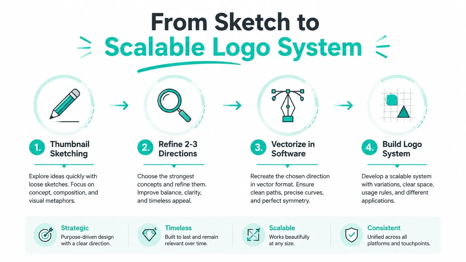
Begin with thumbnail sketches. Small drawings force the concept to rely on shape and proportion instead of decorative detail. Explore several metaphors, then refine two or three directions that meet the brief. Developing every idea indefinitely wastes time and makes comparison harder.
Once a direction earns approval, recreate it as vector artwork in professional design software. Vector files preserve clean edges when the mark moves from a favicon to a large exterior sign. Raster artwork can still be useful for placed images, but it shouldn't be the only master file.
A responsive system usually includes:
- Primary lockup: The preferred combination of symbol and practice name.
- Stacked lockup: A compact arrangement for narrower spaces.
- Icon mark: A symbol-only version for avatars, app-like placements, and small applications.
- Favicon version: A simplified mark designed for very small browser and bookmark contexts.
- Color variations: Full-color, one-color, reversed, and neutral versions for different backgrounds.
Build rules into the handoff
The designer should define clear space around the mark, minimum practical size, approved backgrounds, color values, typefaces, and examples of incorrect use. Include SVG and EPS for scalable applications, PNG for common digital placements, and PDF for print workflows. Provide both transparent and background-specific versions where the practice needs them.
A good handoff also names the files clearly and groups them by use. Your office manager shouldn't have to guess whether “logo-final-2-reallyfinal.png” is suitable for a printer or a website.
Production check: Put the logo on a website header, a scrub top, a business card, a window sign, a social avatar, and a referral sheet before calling the system complete.
Digital healthcare communications often need accurate, current information alongside a coherent visual system. For a related example of live clinical content, see this resource on live exam state update guidance. It illustrates why patient-facing materials benefit from clear structure and dependable presentation, not just attractive styling.
Don't approve a system that works only on a white artboard. Check the mark over light and dark surfaces, in color and monochrome, and at the smallest size patients will encounter. Responsive dental logo design protects recognition when the available space changes.
Budgeting Timelines and Working With Designers the Smart Way
The cheapest path is not always the least expensive. A DIY logo tool may produce a usable starting point quickly, but templates often encourage familiar symbols and limit ownership clarity, customization, and strategic thinking. DIY can make sense for a temporary concept or a very early business, but a practice that expects the identity to support signage, referrals, digital marketing, and growth usually needs a more deliberate process.
A freelance designer can offer close collaboration and focused craft. This route works well when the practice already has a strong position, a clear brief, and someone available to give consolidated feedback. The trade-off is capacity. A solo designer may not provide naming, positioning, messaging, web implementation, or broader brand governance unless those services are separately arranged.
An agency can connect strategy, visual identity, website implementation, and ongoing marketing. That broader process can reduce handoff gaps, but it requires clearer communication and a defined scope. Leaping Lemur Media offers brand and visual identity design, including logo creation and delivery of ready-to-use design assets for healthcare and wellness practices.
Compare the working models
| Route | Useful when | Main trade-off |
|---|---|---|
| DIY tool | You need a temporary or internal starting point | Fast access, limited distinction and strategic guidance |
| Freelancer | You have a focused brief and a clear decision-maker | Personal collaboration, narrower service capacity |
| Agency | The logo must connect with positioning, web, and marketing | Broader expertise, more structured process and scope |
Protect the process from drift
Give every provider the same brief, competitor examples, required applications, decision-makers, and deliverables. Ask how they handle discovery, concept presentation, revisions, file preparation, usage guidance, and intellectual-property ownership. Review portfolios for identity systems in real environments, not only isolated logo mockups.
Avoid open-ended revision cycles. Agree on the number of concept directions, feedback rounds, approval stages, and what counts as a new direction. Keep feedback tied to the strategy: “This feels too playful for our restorative audience” is more useful than “I don't like it.”
Don't choose based on presentation mockups alone. Ask to see small-size examples, single-color versions, dark-background applications, and typography in actual practice materials. The finished identity should make daily use easier, not create a new set of brand problems for your team.
Test Protect and Launch Your New Dental Logo With Confidence
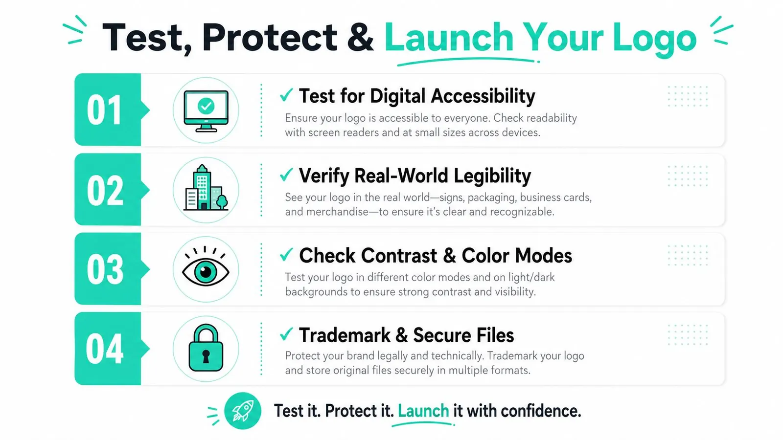
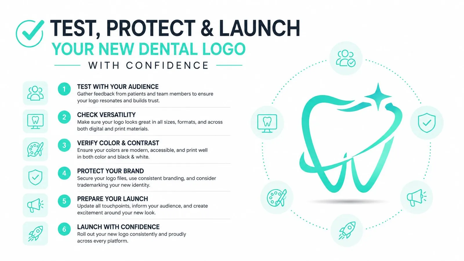
Approval is the beginning of the logo's working life. Before publishing it, test the places where patients will encounter it under ordinary conditions, including a phone screen, a dim office entrance, a printed referral sheet, a staff garment, and a website navigation bar.
Accessibility needs special attention because a logo can function in different ways. Guidance from A-Checks on logo accessibility explains that a logo used purely as branding can be exempt from minimum color-contrast rules, but contrast requirements can apply when it functions as a link or part of a user interface. That distinction matters when the mark appears in navigation, mobile headers, favicons, or button-like placements.
Validate the parts patients must read
Text included in a logo or brand name has no WCAG 2.x contrast requirement when it remains purely branding. If the logo functions as a link or another interactive element, Section 508 guidance says a linked logo should meet at least a 3:1 contrast ratio against adjacent colors, while normal text generally requires 4.5:1 and large text requires 3:1, as detailed in Section 508 color accessibility guidance.
For taglines or readable practice names in marketing materials, the Digital.gov visual design guidance defines large text as 24 px regular or 19 px bold, with a 3:1 contrast requirement instead of 4.5:1. These thresholds don't replace judgment. Test the actual logo, background, size, and interface state.
Protect the identity before broad rollout
Document the first use of the finalized logo, preserve dated files and examples, and establish who owns the source artwork. The ADA advises dentists to document first use and trademark the logo once finalized. The United States Patent and Trademark Office explains that a trademark application is the route to federally register a logo.
Use a staged rollout rather than changing every touchpoint without review:
- Test digital applications: Check headers, navigation, mobile layouts, avatars, and dark-mode or dark-background placements.
- Verify physical applications: Review signage, uniforms, business cards, referral materials, and print quality.
- Confirm system consistency: Use the approved lockups, colors, fonts, spacing, and background rules.
- Secure ownership records: Save source files, document first use, and assess trademark filing with appropriate professional guidance.
- Update priority touchpoints: Start with the website, signage, patient-facing documents, and profiles that patients use to identify the practice.
A distinctive mark earns value through repeated, consistent use. When patients see the same confident identity across the places they research, visit, and refer to, the logo becomes more than a file. It becomes a dependable signal of who your practice is.
If your current identity looks generic, or your team keeps improvising different versions, contact Leaping Lemur Media to discuss a practical brand and logo design process built around your patient experience.
Leaping Lemur Media helps healthcare and wellness practices clarify their positioning, create distinctive visual identities, and receive ready-to-use logo assets for digital and physical applications. Visit Leaping Lemur Media to start a conversation about building a dental brand patients can recognize and trust.
Running a dental practice? See our dental marketing services.