You're probably staring at a logo that felt fine when the practice opened, but now it looks generic, dated, or too soft for the kind of care you provide. That's the trap with healthcare logo design. People treat it like decoration, then wonder why the brand doesn't calm patients, separate them from competitors, or hold up across signage, web, and intake paperwork.
A strong healthcare mark isn't a vibe board exercise. It's a trust contract with a specific patient audience, and it has to work before the first conversation starts. If the logo doesn't signal the right kind of care, the right level of seriousness, and the right amount of clarity, patients feel that friction fast.
Table of Contents
- Why Your Healthcare Logo Is a Trust Decision
- Defining Positioning Before You Open a Design File
- Choosing Colors and Symbols That Match Your Service Category
- Typography, Iconography, and the Wordmark That Carries the Brand
- Accessibility and Regulatory Checks Before You Approve the Final
- File Formats, Sizing, and Logo Governance for Real-World Use
- Testing, Rollout, and the Client Brief Template
Why Your Healthcare Logo Is a Trust Decision
Most practices still approach logo design like they're choosing wallpaper. That's the wrong frame. Your logo is the first visual proof that your practice knows who it serves and understands what patients are afraid of when they reach out.
In healthcare, the same mark can't do the same job for everyone. A dental office needs to reduce tension about pain and procedure. A medspa needs to feel polished without looking cold. A pediatric clinic has to reassure a parent who's already worried about their child. The logo is not just a symbol, it's the first calm signal in the room.
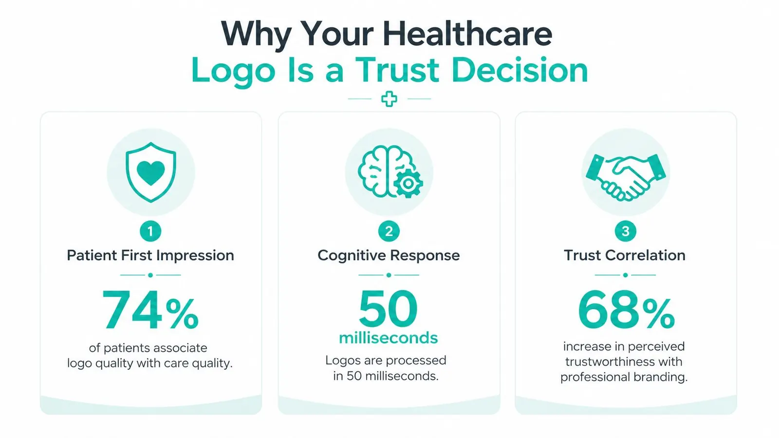
Blue dominates healthcare branding because it keeps showing up where trust matters most. One industry analysis found that blue appears in nearly 85% of leading healthcare logos, and on 99designs it is requested in more than two out of every three healthcare logo projects, while green appears in more than 40% of healthcare business requests on the platform, which makes sense for wellness and preventive care 99designs healthcare color psychology. That doesn't mean blue is always right. It means patients already read it as credible, which is exactly why color choice carries so much weight.
Practical rule: start with the patient's fear, not the designer's preference. If you don't name the fear, the logo becomes a style contest instead of a trust decision.
If you're building or refreshing a practice brand, the first real question is who the logo has to calm, and what promise it has to make instantly. That's the work Leaping Lemur Media talks through with practices on its About page, because the visual identity has to line up with the story you're already telling in person.
Defining Positioning Before You Open a Design File
Before anyone sketches a mark, get the positioning out of your head and onto one page. If you skip that part, you end up with a pretty logo that could belong to ten other practices in your market.
Start with four prompts. What is the one patient fear you solve? What is the single promise that calms it? What three words should staff want patients to use about the front desk experience? Which two competitors should your practice feel clearly different from? Those answers give the designer a job that is possible.
Turn vague taste into a usable brief
A multi-location dental group often needs reassurance and consistency, not a playful personality. A boutique medspa usually needs refinement, but not the stiff kind that makes the brand feel out of reach. A solo ophthalmologist may need precision and competence above all else, because patients are often deciding based on trust in specialized care.
Here's a clean way to write the brief:
- Patient fear: what the patient is worried about before they book.
- Promise: the reassurance your practice can make.
- Front desk words: how the team should sound in the room and on the phone.
- Competitive distance: what visual territory to avoid because competitors already own it.
For a pediatric dentist, that might become “fear of pain,” “gentle care with clear explanations,” “friendly, patient, reassuring,” and “avoid generic cartoon smiles.” For a medspa, it might be “fear of looking overdone,” “natural-looking results with clinical oversight,” “calm, modern,” and “avoid spa clichés that look cheap.” For a solo ophthalmologist, it might be “fear of losing sight or missing a diagnosis,” “care that feels precise and thorough,” “confident, focused, competent,” and “avoid decorative wellness imagery.”
The best brief is short enough that a designer can read it once and immediately know what not to do.
If you want a reference for how practices talk about brand thinking in a way that doesn't collapse into aesthetics, the internal perspective in the Leaping Lemur Media journal is useful because it stays grounded in audience and message, not trend chasing.
Choosing Colors and Symbols That Match Your Service Category
Color and iconography should follow the service, not personal taste. That is the hard rule practice owners need to apply. A mood-board-first palette usually gives you something familiar. A patient-first palette makes the logo do real strategic work.
Read the category before you pick the palette
Healthcare logos do not earn trust in the same way across every service. The trust-perception gap in healthcare-app logos makes that obvious. Nutrition apps scored highest with an average trust rating of 5.78, while sleep apps scored 5.05 and first-aid apps 5.01. Medicine apps came in at 3.91, and child-health apps at 4.00 healthcare app logo study. A pharmacy, a medspa, and a pediatric clinic are answering different emotional questions, so they need different visual answers.
A pharmacy logo should feel dependable and easy to read. A medspa logo should feel refined and controlled, not ornamental. A pediatric practice needs approachability, but clarity still comes first. A nutrition brand can use more warmth and wellness language than a medicine-forward brand because the trust burden is different.
Use colour psychology tips from DesignStack as a starting point for how color changes perception, then measure every choice against the service category. In healthcare, patient expectation beats what looks attractive on a mood board.
Trust Signals by Healthcare Category
| Service Category | Primary Patient Fear | Trust Signal to Project | Visual Cue to Lean Into |
|---|---|---|---|
| Dental | Pain, embarrassment, cost uncertainty | Calm competence | Clean wordmark, steady spacing |
| Medspa | Looking unnatural | Controlled elegance | Minimal type, restrained accent color |
| Pediatric care | A child feeling scared | Warm reassurance | Friendly shapes, simple custom symbol |
| Ophthalmology | Missing something serious | Precision and clarity | Sharp typography, high legibility |
| Pharmacy | Wrong medication or confusion | Reliability | Clear hierarchy, strong contrast |
| Wellness nutrition | Being dismissed or judged | Supportive guidance | Human tone, softer custom icon |
Blue still earns its place in a lot of healthcare brands because audiences already associate it with trust and clinical reliability 99designs healthcare color psychology. Green works when the promise is renewal, prevention, or wellness. Neither color belongs in a logo just because it feels safe or familiar. The test is whether the palette supports the category's promise.
A logo that fits the category is easier to trust, easier to remember, and easier to apply across signage, web, and print.
A useful reference point for how brands talk about healthcare audiences and positioning lives on the Leaping Lemur Media journal, especially if you want to avoid another generic medical badge.
Typography, Iconography, and the Wordmark That Carries the Brand
Most healthcare logos fail in the same place. They ask the icon to carry trust by itself. In practice, the wordmark usually does more of that work, because patients read the name before they decode the symbol. If the type feels weak, the whole logo feels weak, even when the icon looks polished.
Choose type for the emotional job it has to do
Humanist sans serifs are the safest starting point when you want warmth without softness turning muddy. They read clearly and feel patient-friendly. Geometric sans serifs push harder toward clinical authority, which fits ophthalmology, dentistry, and practices that need a sharper edge. A serif can work too, but only when the practice needs to project heritage, stability, or a more premium academic feel.
The mistake is picking type because it is fashionable. A boutique medspa does not need the same letterforms as a pediatric therapy office. A practice serving anxious first-time patients needs type that lowers friction. A specialty clinic serving informed referrals may need more authority than warmth.
Stop borrowing the same medical clichés
Generic symbols are a liability. The caduceus, stethoscope, heartbeat line, and stock-plus mark are so overused that they drain memorability before the logo gets a chance to work. Independent healthcare branding guidance keeps landing on the same answer, simplicity, clean lines, and custom iconography tied to the practice's actual story, as noted in the Spellbrand healthcare branding guide.
That does not mean every healthcare logo needs a metaphor. It means the symbol should be earned. A pediatric dentist might use a friendly character with enough restraint to stay professional. A medspa can let the wordmark do almost all the work and skip the icon entirely. An eye clinic can use a literal pupil or a shape built from the iris, because that is specific enough to feel ownable.
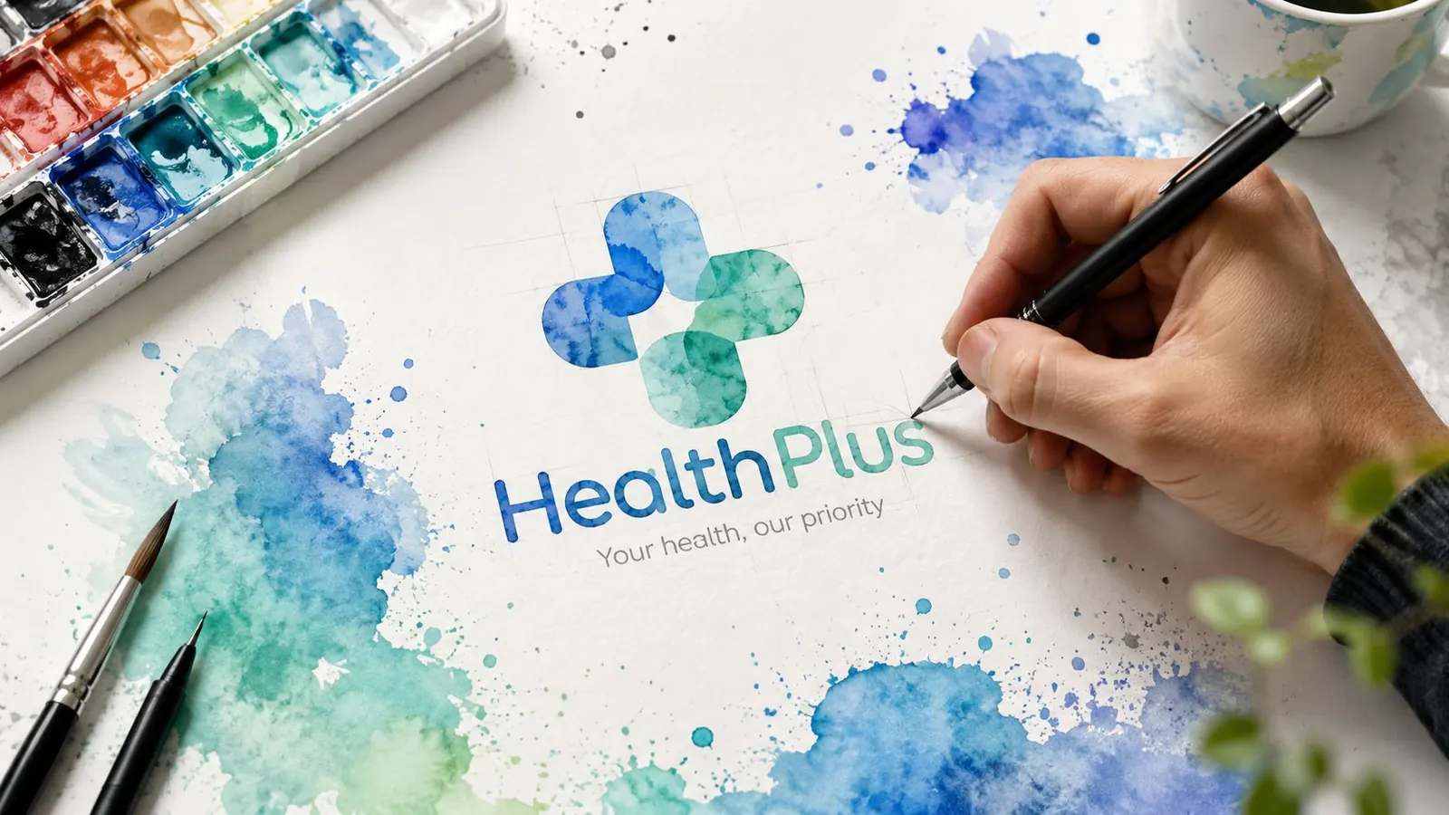
Custom iconography works because it gives the practice something competitors cannot easily copy. It also scales better when the shape is simple enough to survive small sizes and black-and-white reproduction. One of the fastest ways to ruin a medical logo is to pack it with too many literal cues, then wonder why it disappears on a business card or turns muddy on a social avatar.
The better move is to design one recognisable idea and let the typography support it. If the practice story is strong, the mark does not need to shout. Your marketing should sound like you and reach the patients who need you most.
Accessibility and Regulatory Checks Before You Approve the Final
Healthcare branding has to clear real accessibility thresholds, not just look polished in a presentation deck. If the logo fails contrast, it fails the people who need the practice to be easiest to identify.
Test the mark like it's going into a real clinic
WCAG 2.1 AA requires a 4.5:1 contrast ratio for normal text and 3:1 for large text and meaningful UI elements, and healthcare-focused guidance recommends aiming for 7:1 on critical patient instructions Made Good Designs healthcare branding. That matters because a logo rarely lives alone. It sits near wayfinding, forms, appointment confirmations, and patient instructions, where clarity is part of the service.
Color-vision accessibility also has to be designed in, not patched later. An estimated 8% of men and 0.5% of women have color vision deficiency, which is why grayscale testing is essential in healthcare logo work Ampliz healthcare logo accessibility. If the mark only works when color is doing all the meaning, it's not finished.
A practical accessibility check looks like this:
- Grayscale test: remove color and confirm the logo still reads immediately.
- Favicon test: shrink it to tiny digital sizes and see whether it stays recognizable.
- Building-sign test: enlarge it and check whether thin strokes, gaps, and counters hold up.
- Text contrast test: make sure any logo-adjacent text meets the required contrast threshold.
- Meaning test: confirm that no essential information depends on color alone.
For teams looking for a broader example of accessibility thinking in a service business, the AiHeadshots accessibility features page is a useful reminder that accessibility is a product decision, not a cosmetic one.
A strong accessible logo usually looks better, not worse. It's cleaner, simpler, and easier to reproduce. That's not compliance for its own sake, that's better design.
If a logo gets harder to read when you remove color, it was never stable enough for healthcare in the first place.
File Formats, Sizing, and Logo Governance for Real-World Use
A logo isn't done when the main file looks good on a screen. It's done when it survives print, digital, embroidery, signage, and the bad habits of real-world staff who will eventually place it where it shouldn't go.
Ask for a handoff package, not a pretty file
A proper delivery should include AI, EPS, and SVG vector masters, plus PNG and JPG exports for common digital and print uses. The practice should also receive a simplified responsive version for small spaces, because one elaborate mark rarely survives every application equally well. If your logo falls apart as a favicon or turns muddy on a scrub top, the production file set wasn't complete.
You also need rules. Define clear space, minimum size, allowed backgrounds, and misuse examples. That protects the brand when different team members start using the asset across social posts, referral letters, and signage.
Governance matters more than most owners think
Johns Hopkins Medicine says departments, divisions, centers, programs, and other groups should not create their own logo or identifying mark, because that can confuse external audiences and dilute the brand Johns Hopkins Medicine branding FAQs. The same logic applies to multi-location practices and specialty service lines. If everyone improvises their own visual identity, patients stop seeing one practice and start seeing a messy collection of unrelated units.
The practical fix is simple:
- One master mark: keep the core logo consistent everywhere.
- One simplified version: use it for tiny digital placements and embroidery.
- One approval path: make sure only one person signs off on new usages.
- One misuse list: ban stretching, recoloring, and stacking that break the design.
For teams that want a broader service overview, the Leaping Lemur Media services page is relevant because this kind of brand system work lives well beyond a single logo file.
A logo that can't survive a referral fax, a front-desk printout, or a stitched uniform patch is incomplete. Production discipline is part of branding, not an afterthought.
Testing, Rollout, and the Client Brief Template
The best logo in the world still needs proof. If patients, staff, and referral partners don't read it the way you intended, the design has missed the job.
Test the mark before you announce it
Use a five-second test first. Show the logo briefly, then ask what people remember, what kind of practice they think it is, and how it made them feel. Then run preference testing with a small group of stakeholders, but don't ask them which one they “like” best. Ask which one feels most appropriate for the patients you want to serve.
A simple feedback sheet should cover these points:
- First impression: what the viewer thinks the practice does.
- Trust level: whether the logo feels credible and appropriate.
- Clarity: whether the practice name is easy to read.
- Differentiation: whether it feels distinct from competitors.
- Application fit: whether it works on signage, website headers, and print.
Roll it out in the right order
Start with the highest-visibility touchpoints first. Update digital assets, website headers, social profiles, and email signatures before you move into print collateral. Then bring in signage, forms, referral materials, and staff communication so the rollout feels deliberate instead of random.
This is also where practical support matters. If you're using small business AI support articles to help staff adapt copy, plan rollout language, or tighten internal coordination, that can reduce chaos during the transition. The logo change should feel like an organized brand update, not a surprise.
Use a brief that gives the designer real direction
A useful client brief keeps the conversation focused. Copy this structure and fill it in before you talk to an agency or designer:
- Practice type: what you do and who you serve.
- Patient fear: the worry the brand has to calm.
- Single promise: the one reassurance the logo should support.
- Three brand words: how the practice should feel.
- Two competitors: who the logo must not resemble.
- Required applications: where the logo must work, such as web, print, signage, or uniforms.
- Governance: who approves usage and whether sub-brands are allowed.
If you want the branding conversation handled by a team that thinks this way, Leaping Lemur Media works with healthcare and wellness practices on digital presence and brand clarity through its services.
You don't need a louder logo. You need one that speaks clearly to the right patient, holds up in real use, and gives your practice a brand system staff can follow.
If your practice needs a logo that does more than look polished, Leaping Lemur Media can help you turn patient trust into a visual system that holds up across web, print, signage, and rollout. Visit Leaping Lemur Media to start a brand conversation built around your audience, your services, and the way you want patients to feel the moment they see your name.