

You can have a full month of ad reports open on one screen and still not know whether the phone is ringing because of your marketing or despite it. That's the position a lot of local practice owners end up in, staring at clicks, impressions, and platform charts while trying to answer a much simpler question, “Are we bringing in the right patients?” A marketing dashboard solves that by turning scattered data into a clear view of what's working, what's wasting money, and what needs a decision today.
Table of Contents
- Beyond Reports Toward Real Answers
- What Is a Marketing Dashboard Really
- Choosing the Right KPIs for Your Practice
- Sample Dashboards for Healthcare Practices
- How to Read and Act on Your Dashboard Data
- Best Practices for Dashboard Success
Beyond Reports Toward Real Answers
A lot of practices start with a simple need, they want to know if their ads, SEO, and social efforts are helping fill the schedule. Then the reports pile up, one from Google Ads, one from social, another from the website, and another from the CRM, and none of them seem to answer the same question in the same way. That's where owners get stuck, not because they lack data, but because they lack a clear decision point.
A better marketing dashboard doesn't try to show everything. Independent guidance says teams should start with the recurring decisions they make, then map each metric to a decision and remove anything that doesn't change behavior, because dashboards fail when they report data that never affects action (AI Digital). For a local practice, that usually means deciding whether to raise budget, pause a channel, fix a landing page, or rework lead follow-up.
Practical rule: if a number doesn't help you choose between two actions, it probably doesn't belong on the main view.
That mindset matters more in healthcare than in many other local businesses. A dental practice, medspa, or eye care clinic isn't trying to admire traffic trends. It's trying to connect marketing to more booked appointments, better lead quality, and steadier growth without making the owner dig through spreadsheets.
What Is a Marketing Dashboard Really
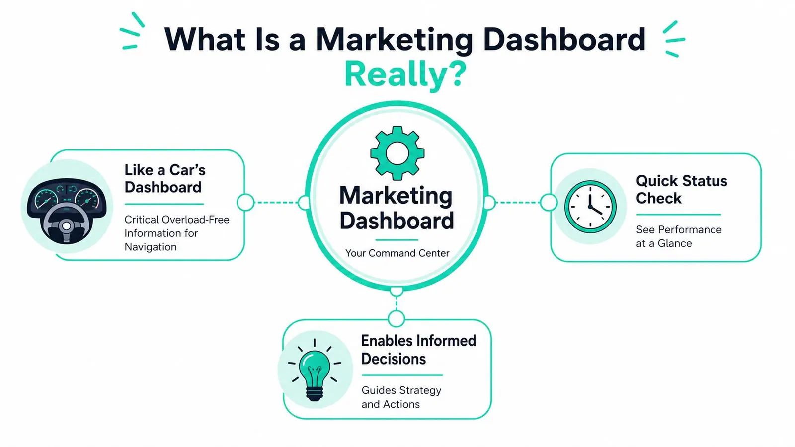
A marketing dashboard gives your practice a quick read on what is happening now, so you can make better calls without digging through separate reports. A front desk lead, office manager, or practice owner should be able to glance at it and see whether marketing is bringing in the right attention, the right leads, and the right next steps. That matters most when the ultimate goal is more patient inquiries, not prettier charts.
The strongest dashboards are built around decisions, not data piles. If you want to know whether a campaign should keep running, whether a landing page needs work, or whether follow-up is slipping, the dashboard should surface the few measures that answer those questions. A useful way to frame that choice is to start with essential sales enablement KPIs and then narrow the view to the signals that matter for your practice.
A live view, not a snapshot
A static report is a finished page. It tells you what happened after someone exported the data, cleaned it, and sent it around. A dashboard is different because it stays connected to your website, ad platforms, and patient or lead tracking tools, so you can spot changes without waiting for the next reporting cycle.
That live view should let you filter by date range, channel, campaign, and geography, so you can move from a broad overview to one source or location without needing analyst help (Improvado). For a busy practice, that kind of control keeps the discussion practical. You can see whether a specific campaign is driving consultation requests, whether one location is underperforming, or whether a channel needs follow-up tweaks.
Why practices outgrow simple reports
Older marketing dashboards often centered on operational measures like web users, goal completions, goal conversion rate, new contacts, MQLs, cost per action, ROAS, and followers (Klipfolio). Those numbers still matter, but they mainly show activity and movement through the funnel.
A practice dashboard needs to go a step further and connect that activity to patient demand. That usually means tracking how marketing affects appointment interest, lead quality, and how quickly the team can respond once someone raises a hand. The best dashboard for a practice gives your team one shared view of what is working, what needs attention, and where to make the next adjustment without turning every review into a spreadsheet session.
Choosing the Right KPIs for Your Practice
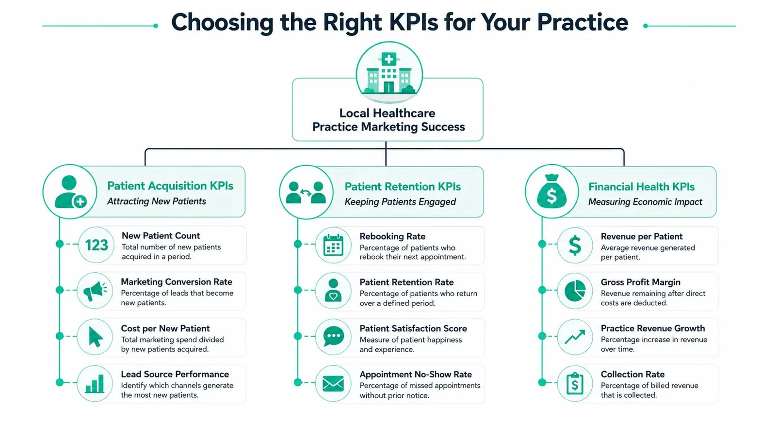
A useful marketing dashboard starts with the questions a practice owner needs answered. Are new patients finding you? Are the right people converting? Are they coming back? If the dashboard cannot answer those questions clearly, it will become a reporting surface instead of a decision tool.
The best KPI mix stays small enough to read quickly and specific enough to guide action. Practices usually need a set of measures that covers discovery, engagement, conversion, retention, and financial impact. That approach keeps the team focused on patient growth, not on collecting numbers for their own sake.
Acquisition metrics that tell you if people are finding you
Start with the basics: cost per lead, customer acquisition cost, return on ad spend, and conversion rate are core measures for a marketing dashboard (Benly). Those numbers show whether your traffic sources are efficient, whether lead generation is getting expensive, and whether your landing pages are doing their job.
Context matters too. Benchmarks can help you spot when a channel is healthy and when it needs attention, but they should never be copied into a practice dashboard without judgment. A dental office, a medspa, and an eye clinic may all measure growth differently, since one may care most about phone calls, another about consultations, and another about rebookings.
A better way to group KPIs is by the decision they support. Visibility, engagement, conversion, and loyalty are easier to act on than a long list of channel-specific metrics. That structure also makes it easier to compare specialties, because the same dashboard logic can support different patient journeys without forcing every practice into the same mold.
A simple KPI table for different practice types
| Metric Category | Dentist KPIs | Medspa KPIs | Eye Doctor KPIs |
|---|---|---|---|
| Visibility | Branded search inquiries, local map views, website visits | Local search inquiries, social reach, landing page visits | Local search inquiries, website visits, referral traffic |
| Engagement | Call clicks, form starts, directions requests | Consultation requests, service page views, call clicks | Appointment request starts, content views, call clicks |
| Conversion | New patient bookings, cost per lead, cost per acquisition | Consult bookings, new client bookings, ROAS | Appointment bookings, lead-to-appointment rate |
| Loyalty | Rebooking, recall response, referrals | Repeat visits, package renewals, referrals | Recall visits, follow-up appointment rate, referrals |
| Financial | CAC, revenue attributed to marketing, ROI | CAC, marketing ROI, revenue attributed to marketing | CAC, revenue attributed to marketing, ROI |
If you want a helpful cross-functional model, the essential sales enablement KPIs resource is a useful companion because it reinforces the habit of linking activity to revenue outcomes. That habit fits practices well, since lead quality and follow-up speed often matter as much as raw lead volume.
Best practice: keep one view for patient acquisition, one for retention, and one for financial impact. Do not force every audience into the same page.
A practice dashboard also needs a small amount of financial truth. Revenue attributed to marketing, CAC payback period, and marketing ROI give an owner a clearer read on whether growth is profitable or just busy. If your team wants a practical starting point, the dashboard examples and measurement notes at Leaping Lemur Media's marketing journal are a useful reference for shaping a view that supports real decisions instead of extra reporting.
Sample Dashboards for Healthcare Practices
The easiest way to make a dashboard useful is to build it around a real decision. For a practice, that usually means one view for the owner and another for the person managing channels or vendors. The owner wants the story in a few minutes. The marketer needs enough detail to move budget with confidence.
The practice owner's growth view
The first template should read like a business pulse check. Keep it high level and tie it to what owners care about, total spend, new patients, cost per acquisition, revenue attributed to marketing, and return on investment. A practical owner view also needs a check on whether acquisition costs fit the value of a patient over time. That kind of balance matters more than chasing activity for its own sake.
That owner view should answer one question fast, “Are we gaining patients efficiently?” The layout can use scorecards across the top, a trend line for new patients over time, and a small comparison block for channel efficiency. The owner does not need keyword bids, ad set IDs, or post-level engagement in this view.
A useful owner dashboard stays simple on purpose.
If the owner needs to ask three follow-up questions before deciding what to do, the dashboard is doing too much.
The marketing channel view
The second template, built for optimization, lets you compare Google Ads, organic search, paid social, and referral activity side by side, then filter by date range, channel, campaign, or geography. That structure matters because marketing performance shifts by segment, and the dashboard should let the user drill into the source of a problem instead of guessing.
A channel view works best when it is interactive and clean. If paid search is outperforming social, the user should be able to isolate that channel, check a specific campaign group, and see whether the issue is traffic quality, landing page friction, or follow-up speed. That is the difference between a reporting picture and a decision tool.
The Leaping Lemur Media journal fits naturally into that reporting process for practices that want written notes alongside dashboard data. A dashboard shows what changed. A journal or recap can explain what was tested, what shifted, and what deserves another look.
How to Read and Act on Your Dashboard Data
A dashboard only matters if it changes what happens next. Plenty of teams glance at the numbers, nod once, and move on. A better approach is to tie each repeated pattern to a clear next move, so the dashboard becomes part of the marketing workflow instead of a screen that looks busy.
Use patterns, not isolated numbers
A marketing dashboard works best when it shows direction, not just totals. Lead count by itself rarely tells the full story, but a rising lead count paired with lower-quality inquiries or higher acquisition cost gives the owner something concrete to respond to. That is the difference between a report and a decision tool.
The point is to look for patterns that affect patient growth, not to collect data for its own sake.
A simple rule of thumb helps keep the view useful:
- If lead volume rises but booked appointments don't, check the landing page, form questions, and follow-up process.
- If cost per lead keeps climbing, review targeting, creative, and where budget is going.
- If one channel looks strong overall but weak by location, drill into geography before cutting the channel.
- If the dashboard keeps prompting manual exports, the reporting setup is probably too slow for the decisions it needs to support.
Set a cadence that matches the audience
Different people need different rhythms. Executive summaries usually work best monthly, while performance dashboards get more value when they are reviewed weekly. That keeps the owner from getting buried in detail and gives the marketing partner enough frequency to catch problems before they become expensive.
Use this standard: owners review the big picture on a regular monthly rhythm, marketing managers review performance weekly, and vendors explain changes with enough context to drive action.
A dashboard also needs follow-through. If the goal is better response from the practice, pair the chart with a specific action list, a budget shift, a landing page test, or a lead-quality audit. If you want help setting that up, a conversation with a marketing partner who can interpret the data and connect it to campaign work is often the fastest next step, and Leaping Lemur Media's contact page is one place to start that discussion.
Best Practices for Dashboard Success
The dashboards that last are the ones people trust, open, and use without friction. For a busy practice owner, that usually means a small set of clear metrics, clean definitions, and automatic updates that answer real questions about patient growth, lead quality, and where marketing is helping the schedule fill up. The strongest guidance focuses on documenting business logic, checking data sources, defining CAC and qualified-lead rules, and watching how the dashboard is used after launch, because a dashboard works best when it is treated like an operational tool, not a report that sits untouched.
Keep the structure simple
Start with a handful of core KPIs and resist the urge to fill every tile. A dashboard should make it easier to answer the same recurring questions every week, not create a new round of interpretation every time someone opens it. If the main page starts to feel like a spreadsheet with colors, the layout needs another pass.
For practices, simplicity also makes it easier to spot what matters. If the owner wants to know whether campaigns are bringing in more qualified patients, the dashboard should surface that answer fast, without forcing the team to hunt through extra charts.
Automate the boring parts
Manual exports create delays and stale information, and that is usually the point where trust starts to slip. Automated refreshes, clear timestamps, and stable data definitions keep the dashboard reliable enough to use in actual decisions. Once the numbers are trusted, the team spends less time reconciling reports and more time improving campaigns.
That matters in practice settings where the next call, form fill, or appointment request can change the week. If the reporting process is slow, the team reacts late, and the budget keeps flowing to channels that may not be pulling in the right patients.
Define terms before people debate them
Words like lead, qualified lead, and CAC need shared definitions. If one person counts form fills as leads and another counts booked consultations, the dashboard will create arguments instead of clarity. A good governance habit is to document those definitions inside the dashboard or alongside it, then revisit them when the business changes.
This is also where a decision-specific dashboard helps. The team should know whether the goal is more inquiries, more booked visits, or better-fit patients, because each goal changes which numbers deserve the first glance.
Monitor dashboard usage
The stronger dashboards are the ones people open repeatedly, not the ones that look polished in a meeting and then disappear. Usage tells you whether the layout is helping the owner, manager, or vendor answer the right questions, or whether it has become another report that needs maintenance. If it is not getting used, simplify it or retire it.
For implementation support, Leaping Lemur Media's services page is a useful starting point if you want help aligning reporting with paid media, conversion optimization, and the day-to-day work of turning traffic into patients.