
Your front desk team is answering the same questions all day. New patients want to know whether you treat their condition, which clinician is right for them, whether you accept their insurance, and how to book. Instead of finding clear answers, they land on an outdated homepage, hunt through vague menus, or abandon a form that asks for too much information.
That's the central challenge of medical practice website design in 2026. A website isn't merely a digital brochure. It's a decision support system that helps patients judge fit, understand the process, trust the practice, and take the next step without unnecessary effort.
A useful redesign roadmap covers seven connected areas: strategy, user experience, compliance, search visibility, conversion, technology, and agency collaboration. The right order matters. A beautiful interface won't solve unclear services, and strong search rankings won't help if patients can't complete an appointment request.
This guide shows you how to prioritize improvements by patient journey impact and compliance value, so your practice can invest in the work that removes the greatest barriers first. If you want to understand how a partner can support that process, you can also learn more about Leaping Lemur Media's approach.
Table of Contents
- Introduction to Medical Practice Website Design
- Planning Your Website Strategy
- Designing User Friendly Accessible Experiences
- Ensuring Compliance and Security
- Optimizing for SEO and Local Visibility
- Crafting Content and Conversion Pathways
- Managing Technology and Partnering with an Agency
- Conclusion and Next Steps
Introduction to Medical Practice Website Design
A patient may visit your practice website after a painful symptom, a worrying diagnosis, or a long day of comparing providers. They need to understand the care you offer without studying your internal departments or decoding medical jargon. Clear navigation, readable content, mobile-friendly pages, and an easy contact route create the starting point.
The homepage works like a reception desk that is open at any hour. It should answer four questions quickly:
- Who do you help? Describe the main services, conditions, or patient groups in plain language.
- Why should a patient trust you? Present clinician credentials, experience, approach to care, and useful patient information.
- What happens next? Explain the first visit, scheduling process, insurance or payment expectations, and preparation requirements.
- How can someone act now? Make booking, calling, portal access, and secure messaging easy to find.
These answers turn a collection of pages into a decision support system. Each page should help a visitor resolve one question and choose a safe next action. A service page, for example, can explain who the treatment suits, establish trust, and point to booking without forcing patients to search through unrelated menus.
Patient portals show why this structure matters. A systematic review reported an overall mean portal adoption rate of 52% across studies, while controlled experiments reached 71% and real-world experiments reached 23%. The contrast shows how interface design and onboarding can affect digital health use the systematic review of patient portal adoption rates. Your website may be the first place a patient encounters booking, records access, or secure messaging.
Practical rule: Design around the patient's next decision, not the practice's internal departments.
The work ahead covers strategy, accessibility, compliance, local visibility, conversion pathways, technology, and agency selection. Prioritize each feature by patient journey impact and compliance value. Practices seeking outside support can review Leaping Lemur Media's approach to website projects.
Planning Your Website Strategy
Begin with a strategy map before choosing colors, templates, or a content management system. Connect audience, patient need, practice position, website action, and measurement. Without these links, a redesign can produce attractive pages that leave patients uncertain about what to do.
Define audiences by need rather than broad demographics alone. A dermatology practice may serve someone researching a new diagnosis, someone comparing treatments, and an established patient seeking follow-up instructions. Each journey requires different evidence and a different next action. Grouping these journeys shows which pages deserve prominent placement and which details belong deeper in the site.
Review the practices patients are likely to compare. Look for practical gaps, such as vague service descriptions, provider information that is hard to find, unclear insurance guidance, difficult booking flows, or missing first-visit expectations. The opportunity may be a clearer explanation of what happens after someone selects “Request an appointment,” rather than a louder brand.
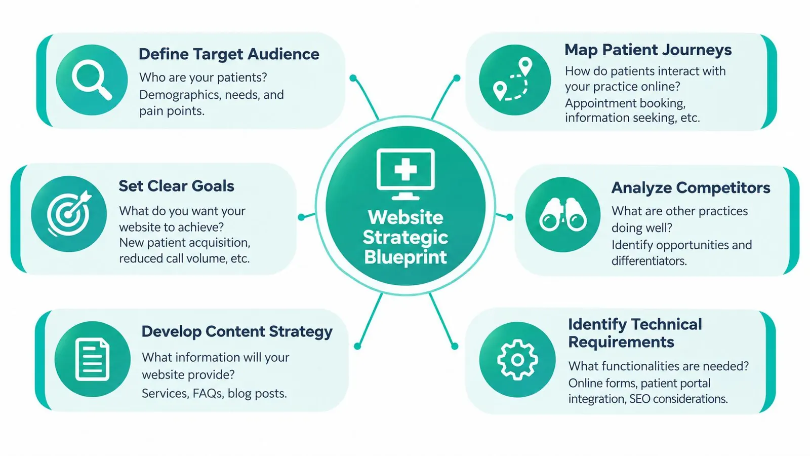
Build the blueprint around decisions
Use this sequence to turn research into design priorities:
- Define the audience: Identify common needs, concerns, access requirements, and reasons a visitor may hesitate.
- Map the journey: Document discovery, service evaluation, provider comparison, booking, preparation, and follow-up.
- Set clear goals: Choose outcomes such as qualified appointment requests, more portal use, or fewer repetitive calls.
- Analyze competitors: Record what nearby practices explain well and where patients must work too hard.
- Develop content priorities: Plan service pages, provider profiles, FAQs, preparation instructions, and educational resources.
- Identify technical requirements: List booking, portal, messaging, form, analytics, accessibility, and security needs.
Portal access should be planned as part of the patient experience, not added after the public site is complete. 90% of healthcare organizations offered patient portal access by 2018, while bill pay availability rose from 45.9% in 2012 to 87.0% in 2020, according to the systematic review cited earlier. These figures support treating the website and connected patient tools as one journey.
Budget according to journey impact and compliance value. A secure, clear appointment pathway may deserve priority over decorative animation because it supports a high-intent action and a sensitive data workflow. Brand expression still matters. Its job is to clarify the decision, not compete with it. Practices seeking outside support can review Leaping Lemur Media's approach to website projects.
Designing User Friendly Accessible Experiences
A patient arrives after hours, wants to know whether the practice treats their concern, and needs to request an appointment from a phone. The website should guide that decision like a helpful receptionist, showing the next step without making the visitor interpret unfamiliar labels. Navigation, page structure, buttons, and forms carry that responsibility online.
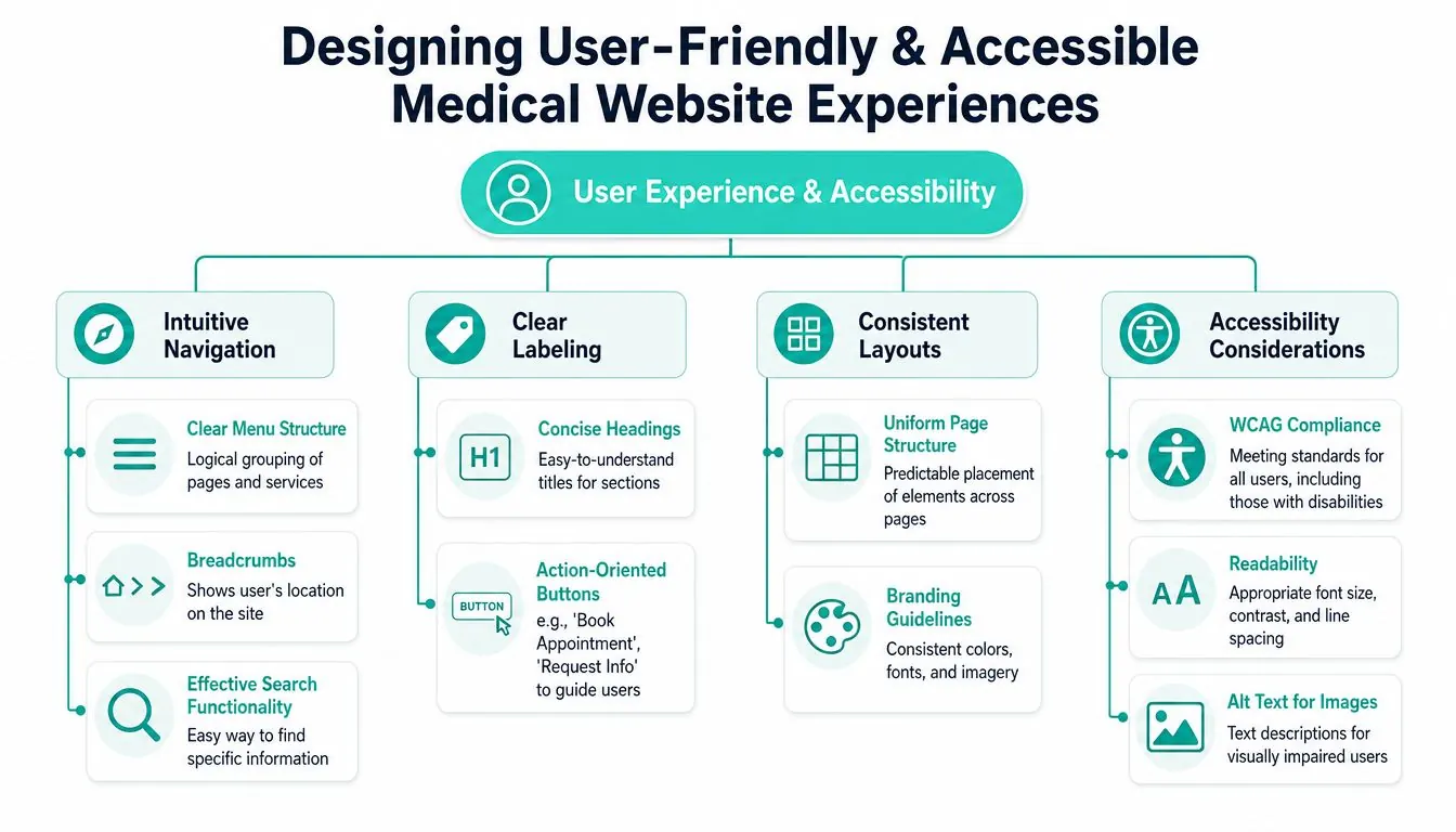
Organize the interface around decisions patients make. Place Appointments, Services, Providers, Patient Information, and Contact where visitors can locate them quickly. “Resources” may sound polished, but “Patient Forms” or “Before Your First Visit” sets a clearer expectation. Repeat each label consistently in menus, buttons, headings, and footers. Prioritize features by their effect on the patient journey. A clear booking route usually supports more value than decorative animation because it helps a high-intent action.
Forms should work like a considerate check-in desk. Ask one question at a time when possible, explain why information is required, mark required fields clearly, and give specific error messages. If an address format is rejected, explain the problem and preserve the patient's other entries instead of forcing a restart.
Make accessibility part of the experience
Build toward WCAG 2.1 Level AA across the public site and connected journeys. Review contrast, keyboard operation, visible focus states, heading order, form labels, alternative text, captions, readable type, and responsive layouts. Test booking and portal pathways themselves, since an accessible homepage cannot compensate for an inaccessible appointment flow.
A healthcare website accessibility scan found widespread gaps against WCAG 2.1 AA, and many sites lacked a visible accessibility solution healthcare accessibility gap findings. Accessibility therefore affects whether patients can use the practice, not merely whether the design looks polished.
Patient testing shows why readability alone is an incomplete measure. In a study of general practice websites, respondents generally rated the sites readable, organized, and accessible the study of patient experience with general practice websites. Yet those qualities do not guarantee that keyboard users, screen-reader users, or patients needing additional interaction support can complete the same tasks.
Accessibility check: Book an appointment using only a keyboard, enlarge the text, turn off images, and trigger every form error. If any step fails, review it as a broken patient journey.
Ensuring Compliance and Security
A patient submits symptoms through an appointment form, the request reaches a scheduling platform, and staff reply by email. Each handoff creates a decision point for privacy and security. Compliance planning should therefore begin with a map of every place the website collects, transmits, stores, or displays patient information, including portal logins, insurance details, secure messages, telehealth tools, downloadable forms, and third-party scheduling embeds.
HIPAA requires covered practices to safeguard electronic patient information and use encryption when reasonable and appropriate. The American Dental Association's guidance on website safeguards and security explains how unsecured forms or portals can expose protected health information and create compliance problems. A polished interface does not make an unsafe workflow acceptable.
Review the full data pathway
Ask the hosting provider, form vendor, booking platform, and messaging provider how each service handles protected health information. Confirm contracts, responsibilities, and permitted uses before collecting sensitive details. If ordinary email is not appropriate for clinical information, replace that form with a secure workflow and give staff clear instructions for reviewing and responding to submissions.
Encryption during transmission is only one checkpoint. Review storage, access permissions, backups, software updates, monitoring, and incident response as connected parts of the same pathway. Technical teams can use mastering SSL certificate deployment to clarify certificate management and renewal responsibilities.
Privacy information must also be easy for patients to find and understand. Covered entities must provide a Notice of Privacy Practices explaining patient rights and the provider's privacy practices. Federal guidance says that, as of February 16, 2026, covered entities must include information about substance use disorder patient records in those notices federal privacy and security guidance. Place the notice in a visible location, use plain language, and review the published version whenever policies or requirements change.
Include accessibility in compliance planning
The HHS Section 504 final rule requires providers receiving HHS funds, including Medicare and Medicaid participants, to meet WCAG 2.1 AA for websites and mobile apps by May 11, 2027, or May 10, 2028 for practices with fewer than 15 employees. Set a review schedule for forms, documents, navigation, and booking tools. An accessibility statement can identify the target standard, known limitations, and a contact method for reporting barriers.
For privacy and policy materials, practices can maintain a clear, patient-friendly privacy policy resource as part of the website's governance process. This gives patients and staff one reliable place to check how information is handled.
Optimizing for SEO and Local Visibility
Search optimization should follow patient language, not internal terminology. Start by listing the services you provide, the conditions you address, the locations you serve, and the questions patients ask before booking. Then assign each important search intent to a useful page.
A service page should explain who the service is for, what it addresses, what the process involves, what preparation may be required, and what the patient should do next. A provider page should make credentials and areas of focus easy to understand. A location page should provide accurate office details, access information, and a direct contact path.
Prioritize the work
| Element | Action | Benefit |
|---|---|---|
| Page titles and descriptions | Describe the service and location accurately | Helps searchers understand the result |
| URL structure | Use short, descriptive paths | Makes pages easier to interpret and maintain |
| Headings | Organize the page around patient questions | Improves scanning and content clarity |
| Internal links | Connect services, providers, FAQs, and booking | Guides visitors through related decisions |
| Local profile | Keep the Google Business Profile accurate | Supports local discovery and patient confidence |
| Structured data | Add appropriate organization, provider, and location details | Gives search engines clearer context |
| Reviews | Follow ethical practice policies for requesting feedback | Adds patient perspective and local trust |
Use analytics to distinguish visibility from usefulness. A page may attract searches but fail to produce calls or appointment requests if it doesn't answer fit questions. Review landing pages, engagement paths, form starts, completed requests, calls, and portal clicks together.
Local information must remain consistent across the website, Google Business Profile, directories, and appointment systems. An audit tool such as the Google Business Profile audit tool can help identify profile completeness and consistency issues. Treat local SEO as maintenance, not a one-time launch task, because hours, services, providers, and locations can change.
Avoid publishing thin pages for every minor keyword variation. A smaller set of clear, condition-specific resources usually serves patients better than repetitive pages that provide little decision support. Search visibility grows from usefulness, accuracy, and a site structure that reflects how people seek care.
Crafting Content and Conversion Pathways
A conversion pathway in healthcare should reduce uncertainty before it asks for commitment. Patients often need to decide whether the practice treats their problem, whether the provider is a good fit, what the first visit involves, and whether payment or insurance expectations are manageable.
Build each high-intent page in that order. Lead with a plain-language service explanation, add provider proof and relevant credentials, address common concerns, explain the next step, and place booking or calling options where the patient is ready to act. Condition-specific entry pages can make this sequence more relevant than sending every visitor to a generic “Services” page.
Keep the first request short
For an initial appointment request, use no more than five fields: name, contact information, service type, preferred date, and insurance. The healthcare website design guide on appointment intake connects short forms and visible calls to action with lower friction and reduced abandonment.
That doesn't mean every clinical intake question belongs on the public website. Separate the initial contact request from the detailed medical history process when possible. Patients are more likely to begin when the first step feels manageable, and your team can direct sensitive information into the appropriate secure system.
Place “Book an Appointment” and “Call the Office” in the header, footer, service pages, provider profiles, and near relevant social proof. Keep button text specific. “Submit” describes a technical action, while “Request an Appointment” tells the visitor what will happen.
Answer objections before the booking decision
Your FAQ should support decisions, not fill empty space. Organize questions by patient stage:
- Fit questions: Do you treat this condition? Which provider handles it?
- Process questions: What happens during the first visit? How long should patients plan to be there?
- Access questions: Do you offer telehealth? Is the office accessible? What language support is available?
- Payment questions: Which insurance plans do you accept? What payment information should patients bring?
- Urgency questions: When should someone call the office instead of using an online request?
Avoid making diagnosis or emergency promises through marketing copy. Include clear guidance for urgent concerns and route clinical questions to appropriate staff or secure channels. Content should inform a decision without pretending to replace medical evaluation.
The strongest healthcare CTA answers two concerns at once: what the patient can do now and what the practice will do after the click.
Managing Technology and Partnering with an Agency
Technology should serve the patient journey and the compliance plan. Start by documenting requirements before comparing platforms. Decide whether your team needs a flexible CMS, specialized healthcare integrations, multiple locations, custom provider directories, portal connections, telehealth links, secure forms, or frequent in-house editing.
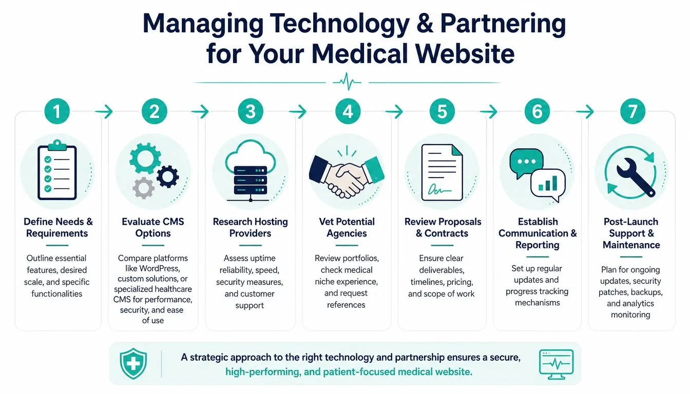
Use a structured selection process
- Define needs and requirements: Separate must-have functions from future enhancements.
- Evaluate CMS options: Compare WordPress, custom solutions, Webflow, or a healthcare-focused CMS for editing, performance, integrations, and governance.
- Research hosting providers: Review security practices, support, backups, maintenance, and performance responsibilities.
- Vet agencies: Examine relevant healthcare work, accessibility processes, data-handling experience, and communication habits.
- Review proposals and contracts: Require specific deliverables, ownership terms, timelines, assumptions, revision rules, and ongoing costs.
- Establish reporting: Agree on project updates, analytics access, testing evidence, and decision points.
- Plan post-launch support: Schedule content updates, security patches, backups, accessibility reviews, and performance monitoring.
WCAG guidance applies to the entire digital ecosystem, including websites, mobile apps, patient portals, telehealth tools, scheduling systems, and PDFs. The healthcare accessibility guidance for digital ecosystems recommends auditing the complete patient journey rather than stopping at the public homepage.
Ask each agency who owns the site, who handles emergencies, how vendors are evaluated, and how they document accessibility and security testing. If triage workflows are part of your scope, you can review GP Triage as an example of a related digital service, then verify whether any integration meets your clinical, privacy, and operational requirements.
For practices comparing strategic and implementation support, Leaping Lemur Media's services include healthcare and wellness website design among its areas of work. Evaluate that option alongside other partners using the same requirements and evidence.
Conclusion and Next Steps
A successful medical practice website makes the patient's next decision easier. It explains what you do, shows who provides care, answers practical objections, protects information, supports accessibility, and offers a clear route to booking or contact.
Use this launch checklist:
- Clarify positioning: State who the practice serves and which needs it addresses.
- Map key journeys: Document discovery, service evaluation, provider selection, booking, preparation, and follow-up.
- Simplify actions: Keep initial appointment requests short and make phone and booking options visible.
- Test accessibility: Review keyboard use, contrast, labels, headings, alt text, documents, portals, and third-party tools.
- Protect data: Audit forms, storage, messaging, hosting, access controls, contracts, and privacy notices.
- Strengthen local visibility: Maintain accurate service, provider, location, and profile information.
- Measure useful outcomes: Track completed requests, calls, portal interactions, and patient questions, not just page views.
- Choose accountable partners: Require clear scope, ownership, reporting, maintenance, and compliance responsibilities.
Don't launch and walk away. Review search queries, failed form attempts, support calls, accessibility reports, and staff feedback regularly. A website becomes more valuable when the practice treats patient friction as evidence and improves the specific journey causing it.
Leaping Lemur Media helps healthcare and wellness practices shape clear positioning, patient-focused website structures, and digital experiences built around calls, forms, bookings, and trust. Visit Leaping Lemur Media to discuss a website strategy that supports your patients and your practice.